Final thoughts and rating
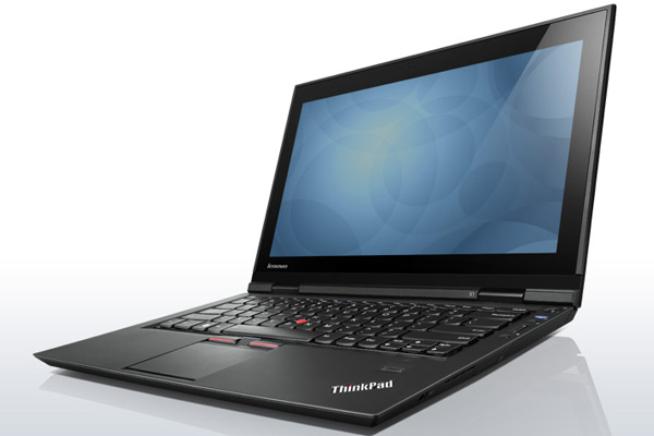
It's easy to fall in love with the ThinkPad X1, and we haven't been able to escape its charms. Everything from its ultra-thin magnesium-alloy frame to its smooth rubberised shell and its contoured keys oozes class and sophistication.
There's a lot to like here, but the machine isn't perfect and a few niggling issues detract from an otherwise stellar notebook. Battery life leaves plenty to be desired, and neither the display nor the trackpad hit all the right notes.
But while a few crucial shortcomings may turn away those seeking business perfection, note that this isn't just another bulky, black ThinkPad for the corporate user. This is a sleek, modern notebook that presents the heart of the ThinkPad brand in a package that's beautiful to behold, a pleasure to touch and, for the most part, a joy to use.

The Good
Beautiful, ultra-thin design
Superb backlit keyboard
Good performance
Great build quality
The Bad
Limited battery life
Highly-reflective display
Integrated trackpad buttons are hit-or-miss
HEXUS Rating

Lenovo ThinkPad X1
HEXUS Where2Buy
The Lenovo ThinkPad X1 notebook is available to purchase from Amazon.co.uk.
HEXUS Right2Reply
At HEXUS, we invite the companies whose products we test to comment on our articles. If any company representatives for the products reviewed choose to respond, we'll publish their commentary here verbatim.


