facebook rss twitter

Image and release date leak for Samsung GALAXY S III?

by Alistair Lowe on 19 March 2012, 09:42

Tags: Samsung (005935.KS)

Quick Link: HEXUS.net/qabdzr

Add to My Vault: x

Over the past few months, many images claiming to be the much awaited Samsung GALAXY S III have appeared, with each one being shot down due to a lack of visual consistency.

However, yesterday on reddit, a picture emerged that has received a generally positive response from the community, which appears to be a leak from UK-based PR firm, Weber Shandwick.
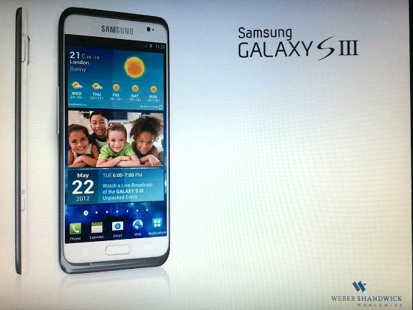
Samsung GALAXY S III

Visually, the device feels spot-on, the screen comes closer to the phone's edge and the side-profile indicates a significant size-reduction by around one third in comparison to the S II. The screen appears to be 16:9 and, given the five icons lining the bottom row, likely features a 720p resolution.

We're not too convinced by the new metallic-style border as this isn't 'typical' Samsung, however if the device is as thin as it appears, it'll be difficult to judge how this affects the overall look and feel from this image alone. Notably, it appears as though a much more significant microphone grill has been integrated into the new finish, which, given that call quality was one of the weak areas of the S II, seems like a positive move. We do hold out some reservations, to the existence of a Home button, as Android 4.0 has attempted to do away with fixed buttons, however, if the space was required for a battery or other components, Samsung may as well place a button there, no doubt it'll be an important comfort-point for any Apple users that the firm may hope to snatch.

Most importantly, however, the image gives away a potential release date for the new device, May 22nd 6pm, GALAXY S III Unpacked Event, with the device's weather forecast indicating London as the location. Tough much later than the expected April release window, with any luck Samsung will have the device ready to hit the shelves as soon as its announcement is made.

This is all well and good, however, can this image truly be believed? If you think so, what do you think of Samsung's new high-end Smartphone?


HEXUS Forums :: 14 Comments

Login with Forum Account

Don't have an account? Register today!
Visually, the device feels spot-on, the screen comes closer to the phone's edge and the side-profile indicates a significant size-reduction by around one third in comparison to the S II. We're not too convinced by the new metallic-style border as this isn't ‘typical’ Samsung, however if the device is as thin as it appears, it'll be difficult to judge how this affects the overall look and feel from this image alone.
Hmm, pretty. :iloveyou: And if that border is slightly raised then that'd be a smart move to give some small protection to the screen. :thumbsup: However if that “size-reduction” also means no MicroSD and - more importantly - no user-replaceable battery, (and/or ultimate insult - a MicroSIM!!!!) then here's one prospective SIII buyer that'll look elsewhere.
We do hold out some reservations, to the existence of a Home button, as Android 4.0 has attempted to do away with fixed buttons, however, if the space was required for a battery or other components, Samsung may as well place a button there, no doubt it'll be an important comfort-point for any Apple users that the firm may hope to snatch.
Hmm, you might want to redact that last bit - or else cause more problems for Samsung with Apple's “crack legal team” (although whether that term indicates their proficiency or preferred recreational activity I wouldn't care to comment on). :D (joking - if it wasn't obvious)
Personally I like the “home button” idea - if for no other reason than if you get lost in some badly designed app (games mostly) that's managed to “lose” the normal (soft) buttons then at least you know that a bang on that “hard” button will get you back to a home page.
crossy
Personally I like the “home button” idea - if for no other reason than if you get lost in some badly designed app (games mostly) that's managed to “lose” the normal (soft) buttons then at least you know that a bang on that “hard” button will get you back to a home page.

This. Gotta have at least one way of returning you to the home screen!
crossy
Personally I like the “home button” idea - if for no other reason than if you get lost in some badly designed app (games mostly) that's managed to “lose” the normal (soft) buttons then at least you know that a bang on that “hard” button will get you back to a home page.

I agree, though the idea is that a home button will always be present in Android 4.0, just that it's a soft-button and so aside from a crash of the touch-screen driver, it should be just as reliable as a hard-button.
Not sure what you mean about the metallic border, my white S2 has a metal border around the edge and looks exactly the same in design as the border for the S3 in this pic
Arthran
Not sure what you mean about the metallic border, my white S2 has a metal border around the edge and looks exactly the same in design as the border for the S3 in this pic

We have a white one in the family, I know what you mean except this one has a much more notable impact on the design from the front and is thick, which isn't the case with the SII, where it's just the enclosing trim.