If you are a regular user of EA's Origin client you might be happy to know there's a big UI overhaul on the way. As evidenced in screenshots of the latest beta version of this connected games software client, Origin is getting a sleek new look and improved functionality.

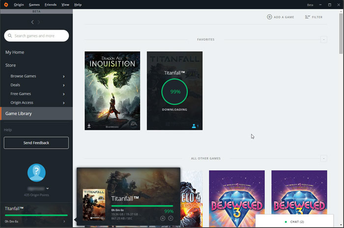
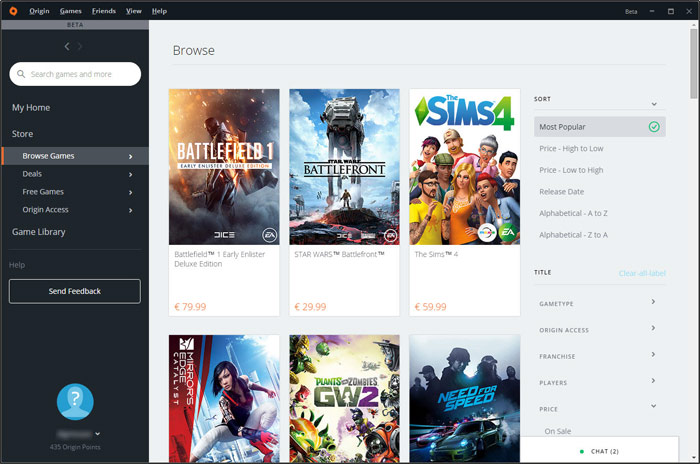
Perhaps the most significant and obvious change to greet you, as you fire up the new beta, will be the quick and intuitive hierarchical menu bar to the left of the main window. This lets you switch views between your library and the store and quickly head to subsections such as game deals, free games, and Origin Access titles. The lower part of this left side strip shows your online profile, friends and so on.
If you select your own game library then you can sort them into your current favourites and other titles for quick access. It's now very easy to see if a game is updating or downloading, as a status circle animates above the game thumbnail.

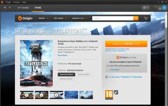
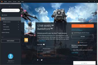
In the Store there are even more ways to sort the resulting lists of gaming titles; popularity, pricing, release date, and alphabetical games sorting are all just a click away. Furthermore, you can click to narrow down searches by game type, franchise, sale status, and more. Once you select a game in the store the resulting quick view if far more expansive as you can see in the Star Wars Battlefront comparison below:
 |
 |
Old vs new 'quick view' screens (click to zoom)
If you are interested in switching to the beta, to test out the new UI before it hits mainstream, a couple of conditions need to be satisfied. First of all this is a gradual rollout, so it might not apply to your system or region. Secondly you must opt into the beta program in your current Origin client. Opt in via the 'Origin > Application Settings' menu. Scrolling to the bottom of that dialogue allows you to check a box for 'Origin Beta Participation'.
NeoGaf forum members reckon the beta Origin client has been heavily 'influenced' by the GOG Galaxy client but it could easily be coincidental.


