Interface, features and conclusion
This is the critical bit. The last Windows Mobile smartphone we played with was the HTC TyTN II and it frankly left us cold. The PC-like menu system just wasn't satisfactory on such a small screen and we spent far too much time furiously pecking at the screen with the stylus like a pigeon on speed.
This wasn't just Microsoft's problem though; the screen itself on the TyTN II wasn't responsive enough. That has been addressed with the HD2 - perhaps too much so. When scrolling or navigating around the phone we found it difficult to make the swiping gesture without accidentally selecting something, which can get old fast. There's no pleasing some people eh?
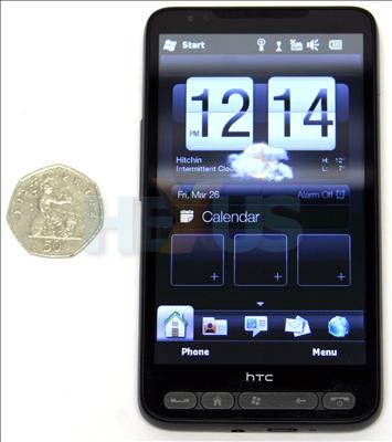
As well as trying to get the best out of WM 6.5, HTC has super-imposed its Sense user interface on the HD2. Made more with Android in mind, it lacks some features on this phone but still makes it more intuitive to use than we imagine it would be otherwise.
The home screen has the big clock and local weather summary we associate with Sense, as well as the shortcut icons and bottom navigation menu. The latter is rendered somewhat redundant, however, but the app/services menu that is revealed when you click on the Windows button.
We try not to get too side-tracked by individual apps in our handset reviews, but one thing any smartphone should provide pretty easily is push email. The phone invites you to set up both Gmail and Microsoft Exchange email and, ironically, setting up Gmail is a lot easier. We got there in the end with Exchange, but Microsoft/HTC could provide a lot more hand-holding through the process.
Also, the interface for viewing email takes a bit of getting used to. There's nothing overtly wrong with it, it's just that after using an Android phone it doesn't feel so smooth and intuitive. It's probably not fair to judge something that will probably be used for two years primarily on how easy it is to use initially, but we're going to anyway.
Camera, etc
The big screen makes the camera a pleasure to use and there are some handy icons to enable emailing or uploading to Facebook (that company has seriously got the social networking market sown-up) in one click. But having said how great it is not to have too many buttons on the handset, having to select camera from the app screen and press the screen to take a photo is a bit of an impediment to spontaneity. Also, camcorder is a separate app to camera.
Battery life, once more, is not great on this phone, and we wouldn't want to spend even one night away from a charger. However, we continue to praise the phone industry for standardising around micro USB, so a charger should never be too far away.
Conclusion
On the whole, the HTC HD2 feels like a great handset slightly let-down by using a creaking OS. HTC has done a great job of trying to paper-over the cracks with Sense, and the HD2 is a whole order of magnitude better than our old TyTN II, but it's hard to recommend the HD2 over it's the Android equivalents that have flooded the market this year.
Having said that, HTC Qualcomm and Microsoft will be reunited once more towards the end of this year, when Windows Phone 7 launches. The HD2 will serve as the basis for comparison for how far Microsoft has come and we'll be referring back to this review then.
The Good
The biggest screen we've seen
Hardware all top-notch
Sense is an improvement over the Windows UI
The not so good
Marketplace not as good as Android or iPhone
UI not as smooth and intuitive as Android
Why get this when Windows Phone 7 is out in six months?
HEXUS Rating
 HTC HD2
HEXUS Where2Buy
Virgin Media and T-Mobile are offering the HTC HD2 'free' on a £35 per month for two years deal. Vodafone has in theory made it available to business users only, but mobilephonesdirect.co.uk is offering the HD2 on Vodafone for £25 per month over two years.
HEXUS Right2Reply
At HEXUS, we invite the companies whose products we test to comment on our articles. If any company representatives for the products reviewed choose to respond, we'll publish their commentary here verbatim.


