YouTube, the popular online repository for Gangnam Style video clips has just finished a revamp of its website. The new “cleaner, simpler look” is supposed to help make “the videos you care about” stand out and to encourage users to use the channels feature to “subscribe, subscribe, subscribe”.
A major part of the YouTube update is the new implementation of the Guide. Adding channel subscriptions to the guide, on your YouTube home page, is supposed to organise the site around your likes whenever you go there to watch videos. The Guide is always up to date with new videos from your subscribed channels says the YouTube blog. The biggest new thing about the Guide is that it will now work across many more devices including “Android, iPhone, PlayStation 3, Google TV and more”.
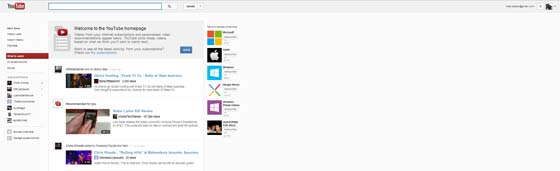
Turning our attention to the new “cleaner, simpler look”; it is this which hits you in the face as soon as you visit the newly redesigned site. The designers have gone quite minimal with lots of white space. If you have a widescreen monitor and your browser window maximised you may think the site looks weird with the content squashed up against the left side. However the blog makes the redesign sound great. “In this new layout, you’ll find the most crucial elements are front and center when you watch a video: the video is right at the top of the page and the subscribe button, social actions and video information are all combined directly below the player. Playlists are now available to the right of the video so you can browse through while you watch. You’ll also see this cleaner and simpler design across the entire site” it tells us.
YouTube on your widescreen monitor?
For a site that is supposed to make “the videos you care about... stand out” I was bemused after the last update which did a great job in burying all the videos I had “favourited”, with the little heart icon, in years before. To find them now I have to go to YouTube, then the Video Manager, then there’s a little favourites menu item on the left to click. (direct link is http://www.youtube.com/my_favorites)
Also turn your attention to the “Recommended channels” on the right of your new YouTube home page. It’s recommended that I “subscribe, subscribe, subscribe” to the Microsoft, Apple, Windows, Google Nexus, and Windows Phone channels, even though none of my current subs are in IT related channels - I just go there for music, usually. This isn’t an enhancement for me it’s just more commercially sponsored channels being thrust in my direction. Another news report concerning the YouTube update, on Neowin today, says that a lot of users are disgruntled following the “improvements”.
Do any readers think the YouTube designers have, to quote the YouTube blog, “learned the secret to making it even better”?