Major improvements
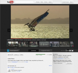
YouTube has begun trialling Cosmic Panda, a long-overdue user interface overhaul, updating not only the aesthetics, but also the usability of the site. The new theme is described as experimental, but this being Google (prone to labelling even long-term, stable products as 'beta' builds) it's a safe bet the redesign will go live soon enough, unless user feedback is overwhelmingly negative.
Unsurprisingly the general theme is similar to the changes made to a number of Google-operated websites. The video player itself is now placed in a darker surround, making it easier to focus on the content - in line with this, the data previously in a column to the right of the video window is now underneath, reflecting the average YouTube visitor's use pattern better - the video, not the uploader, is the focus of most visitors.
Also improved is the video size selection, now allows choice of a number of sizes, with discreet selection, rather than a toggle. Playlists have been given a seeing to, with improved navigation, both when selecting a playlist to watch, and actually switching videos when playing them.
Channels are also revamped, making it easier to see what the various videos in them have to offer and even the video player itself has been given a little spruce-up; although there's no new functionality to it (interestingly, though, annotations seem to be disabled at the moment). The comments section has been given a visual tidy, but no functional improvements -and the content is mostly as banal as ever.
Cosmic Panda is an indisputable improvement for YouTube, and the development team is to be commended to resolving a huge number of issues with the current (or previous, depending on your perspective) YouTube design. We can only hope that it passes its testing phase and sees a site-wide rollout soon.


