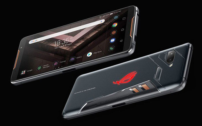
Asus has been teasing the ROG Phone II for a number of weeks and has at last gone official with this powerful gaming phone sequel. Just over a year ago it launched the original ROG Phone which instantly became the fastest gaming phone available. Stand out features of the Rog Phone were an overclocked speed-binned SD845 with Adreno 630 graphics, a 90Hz OLED screen, 'Air Triggers', a gaming vice controller with WiGig Dock, a plentiful 8GB LPDDR4X RAM and an advanced cooling system, plus an optional snap-on active fan cooler. Now the new ROG Phone II has arrived with upgrades a plenty.
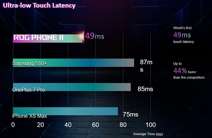
One of the most important aspects of a phone design is the choice of screen. In the new ROG Phone II, Asus has chosen to equip a 6.6-inch FHD+ (2340×1080) 120Hz/1ms AMOLED panel. This Gorilla Glass 6 coated display offers 108 per cent DCI-P3, 10000:1 contrast, Gorilla Glass 6, dE<1, 10-bit HDR and SDR2HDR upsampling. Gamers may be also attracted by its 240Hz touch sampling rate, which gives this device ultra-low touch latency (49ms touch latency, compared to 87ms on the Samsung Galaxy S10+). Last but not least there is a fingerprint scanner under the display.
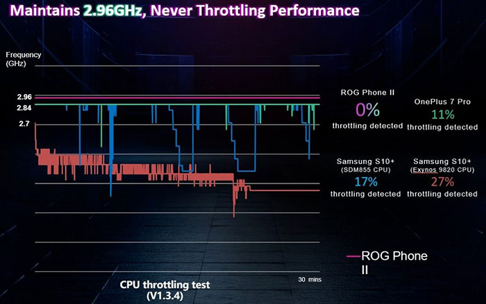
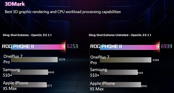
Another important design choice for a gaming phone is of the processor. Asus has chosen te recently revealed Qualcomm Snapdragon 855 Plus overclocked to 2.96GHz, with a GPU overclock to 675MHz. Partnering this processor is a healthy 12GB LPDDR4X RAM, plus 512GB UFS 3.0 storage. Keeping things cool, Asus has equipped a 3D vapour chamber cooling system, and the vents are real in the phone body this year.
The Air Triggers return with the ROG Phone II and this time their latency has been reduced from 63ms to 20ms. Other gaming experience niceties include; dual high-end vibrating motors XYZ axis, dual front-facing DTS:X Ultra stereo speakers, quad-mics with noise cancellation, and the Asus Armoury Crate app (previously called the Control Centre).
More standard smartphone features that are worth highlighting are:
- A 48MP + 13MP rear camera
- 24MP selfie camera
- 3.5mm headphone jack
- 802.11a/b/g/n/ac/ad (5G, 2×2 MIMO) Wi-Fi, BT5, NFC
- 6,000mAh battery (>7 hours of PUBG with the screen set to 60Hz)
- Side: Customized connector (USB 3.1 Gen 2/DP 1.4[4K]/fast charging [QC 3.0 + QC 4.0/PD 3.0]/direct charge) – 30W HyperCharge
- Bottom: Type-C connector (USB 2.0/Fast Charging [QC 3.0/PD 3.0]/direct charge)
- Accelerometer, e-compass, proximity sensor, Hall sensor, ambient light sensor, gyroscope, 2 x ultrasonic AirTrigger sensors
- 170.99 x 77.6 x 9.48mm, 240g
- ROG UI (Android 9 Pie-based)
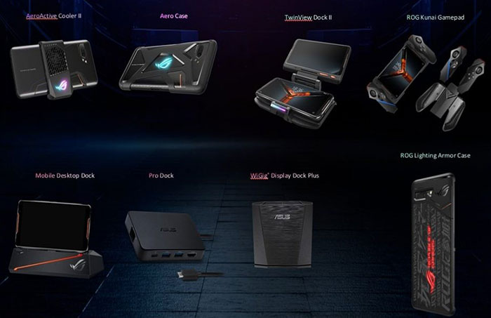
Accessories galore
The new ROG Phone II has even more accessories designed for it than its predecessor. The phone comes bundled with a clip on fan accessory, the new and improved AeroActive Cooler II. As well as this there are various docks and gaming appendages which you can choose from like the new 'Switch Inspired' ROG Kunai Gamepad and TwinView Dock II.
The new Asus ROG Phone II is expected to become available in Taiwan and China tomorrow and will be priced similarly to the original at last year's launch (US$899). The matte-black global model will be launched in the first week of September.
Sources: XDA Developers, The Verge.


