If I could sleep with a piece of hardware...
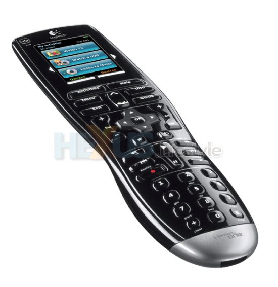
 Well here it is, probably one of the most desirable universal remotes going, the new Harmony One from Logitech. But this isn’t just a bit of an update changing a few bits here and there, the Harmony One features an all new colour touch screen, new button layout and is much more user friendly with it’s intuitive layout.
The 2.2” colour touch-screen uses something called capacitive technology, which responds to tiny electrical charges from the fingertips. Capacitive touch-screen technology is more durable, compared to touch screens that respond to pressure. The colour touch screen provides control of any home entertainment device with an infrared receiver so that’s all your kit under the telly covered. But perhaps the coolest thing is the fact that the Harmony One touch screen can also display icons of specified TV stations for quick access to favourite stations.
 Click for larger image
Logitech has improved the button layout to make it more intuitive. The Harmony One buttons are divided into four distinct zones (numbers; traditional DVD controls; D-pad with volume and channel up/down; and on-screen menu buttons) which should cover just about all of today’s devices. And taking it a step further, each button is individually sculpted, providing tactile cues so people can operate the remote by touch, rather than relying on sight.
Finally, the base of the Harmony One has been curved to give a more comfortable shape which Logitech say is easy for anyone in the family to hold, regardless of hand size. And the recharging station looks pretty slick too with an adjustable light that makes it easy to find, even in the dark.
I soooo want one!
All HEXUS CES 2008 content


