facebook rss twitter

Living with Virgin Media TiVo

by Scott Bicheno on 13 October 2011, 10:47

Tags: Virgin (NASDAQ:VMED)

Quick Link: HEXUS.net/qa7m6

Add to My Vault: x

More functions, niggles and conclusions

The fast-forward and rewind features have three speeds. A pleasing tweak to this is that, when you finish fast-forwarding through ads, the content starts a few seconds earlier than the moment you requested. This is handy given the inevitability of running into your programme before you realize the ads have finished. The colour buttons provide the standard interactive TV functionality, while I never had occasion to use any of the alpha-numeric ones.

The Back button does remind me of one small niggle. There are times when you're navigating around the system when you can't apparently go ‘back', and I felt stuck in an electronic cul-de-sac. The only alternative was to press ‘TV' and start all over again, which was a bit annoying if it had taken me a while to get to where I was. This is a small UX glitch which will hopefully get ironed out in future software updates.

While I'm moaning, I should point out that programmes aren't always recorded in their entirety. The system clearly decides when to begin and end recording according to the schedule, as opposed to what's actually happening on the screen, which means it sometimes stops before the programme has finished. You can add on an extra few minutes manually when setting up the recording, but this is an inelegant solution.

Pretty much the only other annoyance that springs to mind concerns the powerful search function. The facility itself is great - you can put in a few letters of a search term and it provides links to any piece of content, or individuals, that feature those letters. The problem is it does a new search every time you put in a new letter, so there's a significant pause before you can enter another.
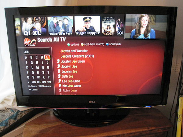


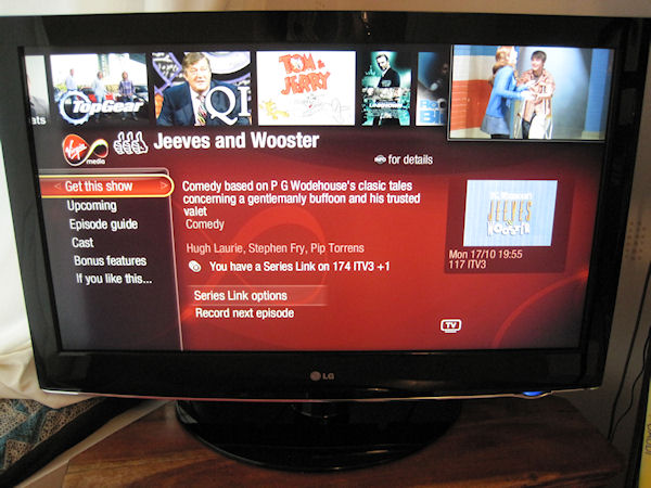
Again, this is a small UX niggle, but hopefully one that will be ironed out soon - especially if the leaked update is accurate. The links provided are extensively cross-indexed, and the image below shows what I got when I selected Jeeves and Wooster. As well as providing recording information - including the ability to record an entire series - there's also all kinds of meta-data such as guides about shows and the cast.


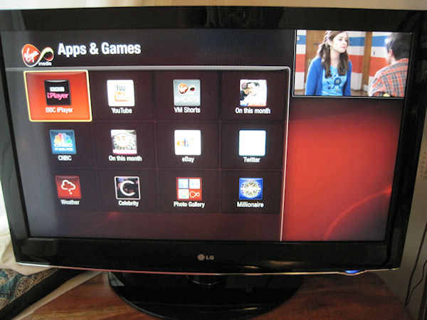
To finish off my walk-though, the on-demand section allows you to find VOD content chronologically. The relatively rudimentary app facility enables you to access things like the BBC iPlayer and YouTube, as well as the recently-added Sky Anytime, but has the potential to be a much more prominent feature as the still young TV apps industry matures.


The version I used didn't include premium services such as Sky Sports, which is fair enough as they're not necessary for the purpose of evaluating the service, but even with the vanilla package you get more channels than on Freeview. This includes Sky Living, which offers things like America's Next Top Model, of which Mrs B is inexplicably fond. On top of the access to VOD content, and a bunch of HD channels, this means you do get more than just clever functionality, even with the basic package.

As this isn't a review I'm not going to give you any advice one way or the other about whether you should invest in Virgin Media TiVo. As a family we have found the experience generally very positive. It's a very powerful system and is sufficiently user-friendly to mostly avoid the sensation of wrestling with the technology.

But I got to use it for free; it's up to each individual to work out whether all this TV goodness is worth paying for, and how it compares to the Sky+ offering. Or even, dare even suggest it, just settling with Freeview. In summary my family and I will be sad to see the Virgin Media TiVo box go, but we'll cope.


HEXUS Forums :: 14 Comments

Login with Forum Account

Don't have an account? Register today!
Didn't notice or mention one of tivo's main features:

wishlists - there you can set it to record by a keyword or actor
e.g. it will record every programme with “morgan freeman” in, regardless of channel - including films and chat shows etc.
You set these once and they work forever.

Of course many of us have had TiVos since 1999,
this new one just adds 3 tuners, thumbnails and HD

In some ways the old one is better and quicker…
Before I finish reading this I thought I'd ask if we could stop calling abbreviations acronyms. An acronym is used for initials of a phrase that are pronounced as a word themselves, for example NATO (North Atlantic Treaty Organisation) is an acronym but LCD (Liquid Crystal Display) is an abbreviation (or more specifically initialism).

http://lyberty.com/encyc/articles/abbr.html

EDIT: Could you let me know what you mean by UX in this phrase: “This is a small UX glitch” I thought UI (User Interface) would of been more appropriate.

They have made some very good improvements over the older system I've tried. Navigation definitely sounds much more intuitive and made simpler than before. I like the ability to access TV apps like iPlayer and Sky Anytime, I hope more apps like these get developed as they make viewing TV programs so much better for me. I hope we get a completely on demand TV service available soon, Sports might not do so well but everything else would be far more appealing if I could watch it at any time I want without having to record it.
Good “review” - what I've wondered about Tivo is whether there's anyway to make sure it's recommendations are appropriate to the person using the remote. E.g. if my family use the voting buttons, then I'm going to end up being “treated” to a diet of East Enders, Casualty, iCarly, Top Gear, Spongebob, NCIS and CSI.

Interesting to see those comments about fast forwarding - I just wish that someone would implement the “Content Skip” feature from my old Panasonic HDD-DVR. That skipped forwards in 30 second increments per button press, but was clever enough to cut the skip short if it detected that the ads had finished.

Very tempted to the Tivo - especially as it's “Powered by Linux”. :geek:
ExHail
EDIT: Could you let me know what you mean by UX in this phrase: “This is a small UX glitch” I thought UI (User Interface) would of been more appropriate.

User eXperience?

In response to the original article though. I guess it can't be that great if you're sending it back and not subscribing.
crossy
Good “review” - what I've wondered about Tivo is whether there's anyway to make sure it's recommendations are appropriate to the person using the remote. E.g. if my family use the voting buttons, then I'm going to end up being “treated” to a diet of East Enders, Casualty, iCarly, Top Gear, Spongebob, NCIS and CSI.

Interesting to see those comments about fast forwarding - I just wish that someone would implement the “Content Skip” feature from my old Panasonic HDD-DVR. That skipped forwards in 30 second increments per button press, but was clever enough to cut the skip short if it detected that the ads had finished.

Very tempted to the Tivo - especially as it's “Powered by Linux”. :geek:

The thumbs up system records stuff that it thinks you will like, so if someone else has given the thumbs up, yes, you will get their content, but it stores it in a ‘Suggestions’ folder so it doesn't get in the way of stuff you've actually wanted to record.

Go on, get one. The 500gb one is free now, so what are you losing? (apart from the installation fee)