One to write home about
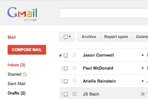
With the launch of its Plus social network under way, in its initial limited-invite state, at least, and a homepage redesign pushed out, Google's next step will be an overhaul of its Gmail interface.
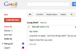
The redesign will bring a much less cluttered view aimed not only at bringing Google's web-based email portal into line with the new style of the homepage and Plus social network but also intended to make it easier and more pleasant to use Gmail as a day to day tool. The new look comes in two varieties, the only difference being the amount of space between elements on the page, with the denser layout working better on small systems, such as netbooks where pixels are at a premium.
The updated looks are available as optional themes while in development, and there are a fair few kinks to be worked out before the updated look is ready for prime time. Primarily the issues are with Labs features, so users not enabling many trial features should find that the updated themes work without any issue at all.
Once these initial new, slicker, themes are completed Google also plans to add some different colour schemes, including a darker interface for working at night, a pastel theme, and a drawing-based look - because of if there's one thing Google needs more of, that's doodles.
Google Calendar is also being updated over the next few days, again removing clutter from the interface and bringing the aesthetic toward a common theme. As if these updates aren't enough, Google has also launched a beta version of a photo sharing app called Pool Party; it's a simple enough tool but its existence at all is interesting. The app has been created by a team from Slide, recently acquired by Google, and, in effect, competes with the image upload capability of Google Plus.
With its entry into the social networking space once again, and these updates to its products ensuring consistency across the range of Google services, it looks like the company is making a serious stab at consolidating its efforts against the competition - it will prove interesting to see how successful that bid proves.


