facebook rss twitter

Microsoft: help us choose the new default Office font

by Mark Tyson on 29 April 2021, 12:11

Tags: Microsoft (NASDAQ:MSFT), Office 2007

Quick Link: HEXUS.net/qaeqjd

Add to My Vault: x

Please log in to view Printer Friendly Layout

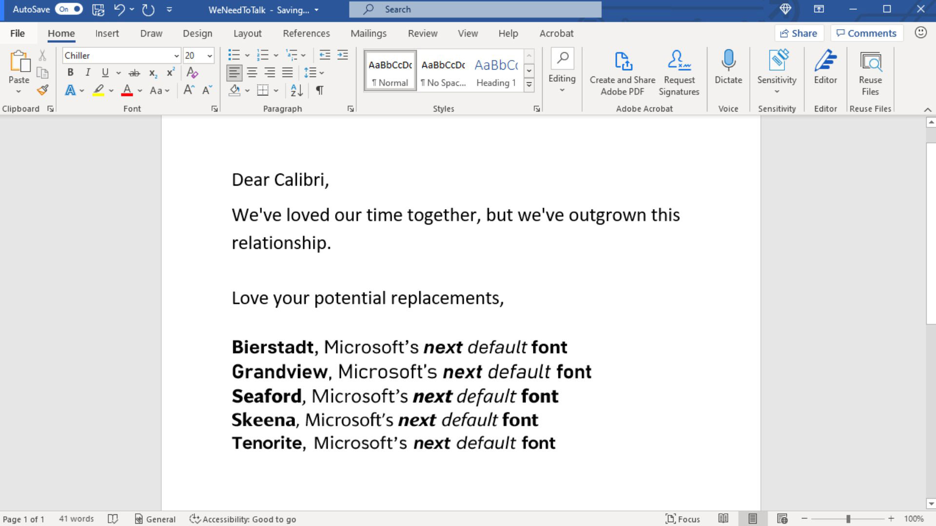
Calibri has been the default font for Microsoft Office tools since 2007, but now the firm is harking after change. In case you wondered what the default was before it, that honour was taken by Times New Roman. Thus, a sans-serif face replaced a serif one, and it did do on many of the communications people created, printed, and sent to one another. Many people just stick to defaults.

Rather than hunt through the squillions of already in existence fonts that are out there for a worthy successor, Microsoft's Office design managers have decided to commission five new fonts to provide a shortlist choice with the necessary flexibility, readability, and wide range of glyphs that a default font requires.

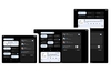
The five new fonts are called Tenorite, Bierstadt, Skeena, Seaford, and Grandview. Microsoft says those who are very interested in this choice shouldn't worry as whichever Microsoft / the community chooses as default, all of these five designs will become available to Office users via the font menu. They are already live in the cloud based Microsoft 365 apps and experiences.

The five new fonts span four sans-serif styles and Microsoft has provided short interviews with the designers in its blog, if you want to read more. I've embedded the neat Scrabble tile presentations of the fonts above and below. The top screenshot comes from Microsoft's Twitter feed where you can comment and the 'quick brown fox' text might be useful for your consideration, as below.


HEXUS Forums :: 11 Comments

Login with Forum Account

Don't have an account? Register today!
I've not even gotten onto a version of office with calibri yet
Fonty mcFontFace?
It might be down to screen res and size but when I saw this in the thread list, the last word was missing, so it read

“Microsoft: help us choose the new default Office”

My immediate thought was 'They sure did. Several years ago. They helped me chhose Libre Office".

I guess that last word changes it a bit. Well, not my choice of Office, but the thread subject. Oops. :D
There's things I do and don't like about each, but none of them are an ideal combination of serifs, loops, weight and letter spacing/kerning (in my opinion)

Microsoft just know they are all sub standard and want to blame the community for choosing a bad font, that they have probably already settled on anyway.
virtuo
There's things I do and don't like about each, but none of them are an ideal combination of serifs, loops, weight and letter spacing/kerning (in my opinion)

Microsoft just know they are all sub standard and want to blame the community for choosing a bad font, that they have probably already settled on anyway.

It's hard not to be cynical about it isn't it? What's wrong with calibri anyway? There are far worse fonts out there. Still, change is good. The shift from TNR was welcome, it may be this is similar.