At the beginning of the week HEXUS news watchers will have seen that Microsoft had finally edged beyond the 1bn active devices milestone. This was a very significant milestone, obviously, and Microsoft made it even more so by mispredicting that it would reach this point years earlier than it actually managed to do so.
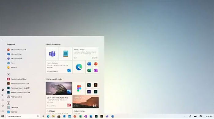
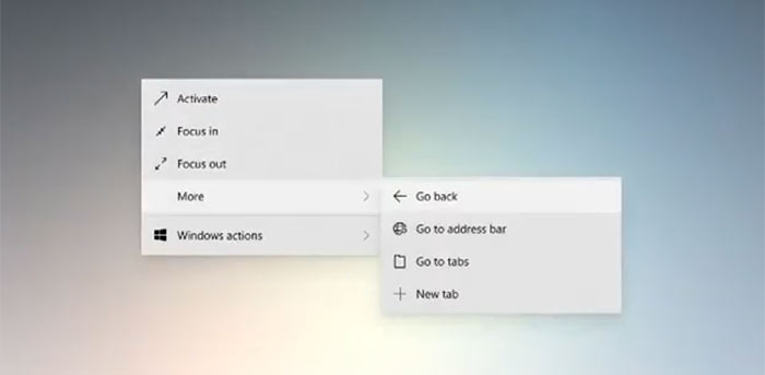
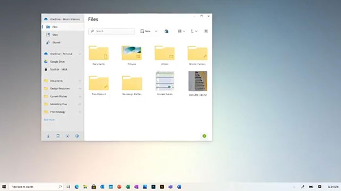
Yesterday Microsoft's Chief Product Officer for Windows, Panos Panay, uploaded a celebratory video to Instagram, marking the Windows OS's advancement from Windows 1.0 to the present day. The video accidentally / on purpose (delete as applicable) went a little bit further than the present day however - at the end of the video is a glimpse at Windows 10 with new Fluent UI icons, and an updated Start Menu.
I've grabbed the Instagram video to embed above but its only 360p, sorry.
Checking through the above you will be able to catch a glimpse of things to come for Windows 10 but it is so fast paced liberal use of the space bar / pause button is recommended.

Perhaps the most striking difference that can easily be spotted is the new Start Menu. Out go the colourful blocky Live Tiles of old and in comes a more modern look which can still emphasise and update with content and which adapts deftly to light and dark modes in the OS.

In 10 days time Microsoft is planning to have an online event to unveil consumer subscriptions for its Microsoft 365 service. It is thought that this subscription product will include Office, Microsoft Teams, a password manager, and some general consumer-focused features. It might also be a platform to introduce these UI changes properly, unless it holds out until the digital-event only Build 2020 developers' conference in mid-May.


