From the announcement of Android 4.0 last November, it has been clear that Google intends to refocus on application and device consistency with the new OS. For example, gestures such as 'flick left' or 'flick right' now exist and behave consistently throughout more elements of Android and Google is requiring that firms must maintain the default 'Holo' theme's widget and design elements for access to any Google apps, including Market.
Google has taken matters a step further recently and launched a new website, Android Design, showing app developers Google's creative vision and Android 4.0's design principals. The site goes into further detail, discussing the expected workings of typical building blocks such as Text Fields and Progress Bars, with quick check lists to ensure applications look and behave as expected.
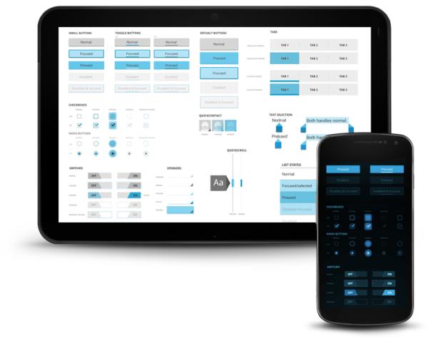
Given the success of iOS and its heavily consistent UI experience brought about Apple's strict approval guidelines, it's understandable that Google would wish to obtain some of the same benefits such a system brings; a reduced device learning curve and meeting user expectations from one app to another. Android Design is how Google will attempt to reach this goal, ensuring that developers are aware of Google's design process, detailing the expected behaviours that would otherwise need deciphering from existing first-party apps. The hope is that this will become the 'Go To' page for developers and enable the adoption of a consistent UI without imposing strict approval schemes.
We here at HEXUS certainly support Google's balanced approach, guiding developers down the correct path whilst still allowing them to deviate as their design needs require but, what do our readers think to Google's new approach to application design?