As the Senior Art Lead, it’s my job to figure out how to turn Positron and the rest of the team’s ideas into visual realities. Coming from both a film and environment art background, I am always excited when the opportunity to create new settings for the game presents itself. A Task Force inspired by ancient Greece and Rome, however, was genre-stretching territory we’d never ventured into before, and presented some serious challenges.
Could Heroes and Villains of every imaginable variety fit into an ancient, fantastic setting? Would Cimerora feel as connected to the Hero and Villain experience as Atlas Park or Mercy Island? Would it be exciting to see super powered battles between leather and bronze clad warriors in sandals versus Heroes and Villains in tights? I’d like to give you a glimpse into the process that took Cimerora from concept to completion!
Creating Cimerora: The Process
1 – Genesis of the Idea
Creating Greek and Roman inspired mission content was something that we wanted to do with Issue 11: A Stitch in Time. It was always a goal of ours for that Issue to really make you feel like a time traveler by going back to ancient times and interacting with the locals there. Unfortunately, when all the art tasks for Issue 11 were estimated, it became apparent that we would not be able to complete it for that Issue. We did, however, start work on several assets that we knew we would need once we got the content underway.
 Click for larger image
2 – Mission/Zone Concept
For Issue 12, Positron (Matt Miller) and Hero 1 (Joe Morrissey) had a time traveling Task Force in mind with several fairly epic missions. It quickly became clear that in order to truly support the Task Force content, Cimerora would need to become a place of its own.
Taking Heroes and Villains to ancient times was a huge challenge conceptually and visually, and we felt that providing a persistent area for players to explore, team up in, and even resurrect if needed, would help make the experience feel more natural.
Another key conceptual goal for Cimerora was to make it feel like a real place, rather than just a play space. To make this a reality, we decided that all mission and zone content should be interconnected, forming a more continuous geographical area for players to explore.
 Click for larger image
3 – Asset Concept and Creation
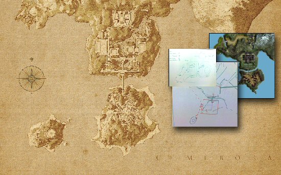
While Hero 1 retreated to his cave to design the mission and story content of the zone, I drew up a rough map of the spaces we’d need and the environment artists began gathering reference and prototyping assets for the zone.
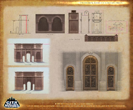
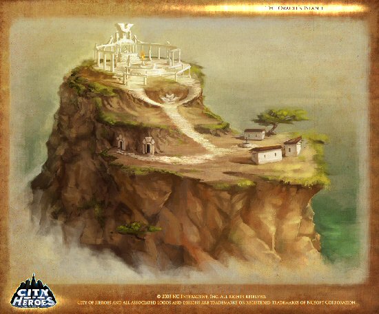
For signature architecture and locations we turned to our fantastic concept artist, Carolina Tello Alvarado, who illustrated all of the key architecture and iconography for Castellum Quarter and the Oracle’s Island . These illustrations, along with the advance work we did during Issue 11, helped the environment team work quickly and effectively to create and refine literally thousands of new visual assets encompassing everything from cliffs and terrain to buildings and fortresses.
4 – Environment Layout and Prototyping
Once the library of Cimeroran assets had begun to take shape, Don Pham and Ryan Roth of our environment team worked closely with Hero 1 and War Witch (Melissa Bianco) to create the map layouts you’ll find in Cimerora. Reveals and vistas were carefully planned and “white boxed” in order to ensure that the story was revealed visually as intended. “White boxing” is the process of using an easily changeable, temporary layout to make sure game play, “pathing” and overall flow is working properly.
 Click for larger image
5 – Revision
White boxed zones often change daily based on play testing, story modifications; or simply because some ideas sound great on paper, but don’t work so well in game. This was the case with the Castellum Quarter mission map for the Time’s Arrow Task Force. The original design of Castellum Quarter called for a high class temple district with beautiful gardens, but when the environments were created in the editor, it became apparent that the mood just wasn’t sinister and epic enough to sell the story content. The white boxed level was torn down, and a new Castellum Quarter was born as a huge fortress atop craggy cliffs , connected by soaring bridges.
6 - Population, Revision and More Revision
As the Art and Design teams reached consensus on the layouts for Cimerora and its associated missions, War Witch began drawing on the fantastic Greek and Roman inspired characters and costumes Jay Doherty created as well as the spectacular new animations and FX that Back Alley Brawler (Chris Bruce) and the animation team supplied to populate each map with dynamic spawns and NPCs.
Shortly after the maps were populated and missions were hooked up, it was time for play testing, and inevitably, more revisions!
7- Polish and Release
During the final days before release, feedback from internal play tests as well as from closed and open beta testing is examined. Game play is tweaked, geometry holes are plugged, and textures, scene settings, music and audio are all finalized for release. By the time you set foot in Cimerora, its final content will have been contributed to by almost every member of the Art and Design teams.
Final Words
Cimerora is one of my favorite places in the CoH/CoV universe, and is a truly unique zone that has allowed us to push the game’s visuals and level design in new, more focused and immersive directions. I hope Heroes and Villains alike find their travels in Cimerora to be as exciting and memorable as it has been for the team to create this new zone!


