Microsoft has taken the plunge and decided to change the company corporate logo before the launch of Windows 8, Windows RT, Windows Phone 8 and all the new computing devices that will accompany these new operating systems. For the first time ever the logo will be accompanied by a symbol; a four pane multi-colour window. This is an arrangement and look that is similar to logos for the Windows OS.
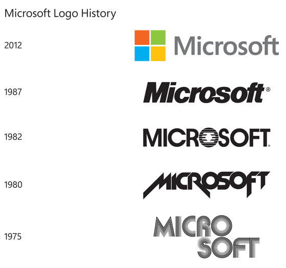
Jeffrey Meisner, writing on the Official Microsoft Blog wrote about the reasoning behind the corporate logo redesign; “It’s been 25 years since we’ve updated the Microsoft logo and now is the perfect time for a change. This is an incredibly exciting year for Microsoft as we prepare to release new versions of nearly all of our products. From Windows 8 to Windows Phone 8 to Xbox services to the next version of Office, you will see a common look and feel across these products providing a familiar and seamless experience on PCs, phones, tablets and TVs.” He said that this new logo “visually accentuates this new beginning”.
Breaking down the logo into its constituent parts Meisner explains what each part represents; “The logo has two components: the logotype and the symbol. For the logotype, we are using the Segoe font which is the same font we use in our products as well as our marketing communications. The symbol is important in a world of digital motion (as demonstrated in the video above.) The symbol’s squares of colour are intended to express the company’s diverse portfolio of products.” In the video you can clearly see the four colour panes being assembled from several Microsoft flagship products; Windows (blue), Office (red), XBOX (green) and, err… a yellowy one!
The coloured four pane symbol appearing as part of the new Microsoft logo does appear to have been used before. Readers at the NeoWin Windows news blog pointed out to the editors that Microsoft used almost precisely the same design and colours in a promotional video showing off multitasking within Windows 95! Also readers were quick to comment that the new four pane design looks more like a window than Window’s own symbol design, which looks like a flag. The Windows 95 four pane design differs a little in colour to the new Microsoft symbol design but part of that could be explained by the US television standard NTSC (Acronym reads - Never The Same Colour). Please check out the Windows 95 video below.
It will take some time for Microsoft to implement the new logo and update all the previous literature and products the company logo is used upon, so you might spot the old one here and there for a while. It’s already implemented on Microsoft.com and the symbol works nicely as a favicon too. Yesterday coinciding with the new logo announcement three Microsoft retail stores were updated with the new design.
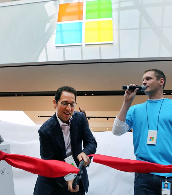
Microsoft Chief Marketing Officer Chris Capossela opens the Microsoft Store in Boston,
which dons the company's new logo, on Aug. 23, 2012.