facebook rss twitter

Review: Windows 8 - Part Two: Modern UI

by Parm Mann on 30 October 2012, 12:00

Tags: Microsoft (NASDAQ:MSFT), Windows 8

Quick Link: HEXUS.net/qabogn

Add to My Vault: x

You Win Some, You Lose Some

The big question, we suppose, is this; Windows 7 works wonderfully well, so why the need for so much change?

There are a couple of obvious reasons. With the PC market beginning to fade, Microsoft needs an interface that appeals to the touchscreen crowd as well as the traditional desktop user. The app experience on previous Windows releases has been old-fashioned at best, and Microsoft needs a central store that keeps revenue flowing in, developers attracted and consumers entertained. And while previous Windows releases have relied on third-party entertainment experiences; Microsoft now has a cross-platform music, video and gaming hub of its own.

The challenges are huge, but Microsoft's hardware and software portfolio puts Windows 8 in an advantageous position. The design philosophy of the Modern UI extends across multiple devices in an attempt to breed familiarity, the Windows Store is likely to become one of the biggest app repositories in the world, and the Xbox brand is well-established and ideally placed to take on the likes of iTunes.

There are other, more subtle advantages to the Modern UI, too. Each app downloaded from the Windows Store is sandboxed, allowing users to install and uninstall apps at will while being safe in the knowledge that no files will be left behind. The days of rummaging through the registry are coming to a close.

Limitations

For a lot of people, the Modern UI will be a great computing experience. Sure, there's a learning curve involved - a fairly steep one if you're accustomed to doing things the old way - but get to know it and it starts to feel like home.

But there are quite a few provisos, too, particularly where power users are concerned. The Modern UI is clearly designed for touchscreen devices such as tablet PCs, but on a desktop with a keyboard and mouse, it poses a number of limitations that hamper its value.


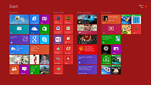
The obvious oddity is that Windows 8 feels like two operating systems merged into one. The Modern UI might be dubbed a user interface, but in reality it's a complete environment, and it sits alongside a more conventional experience we know as the desktop.

What complicates matters is that the familiar desktop runs on the ubiquitous Win32 runtime, while the Modern UI runs on a new runtime dubbed WinRT (Windows Runtime). This segregation introduces limitations, and it's the reason why apps from the Windows Store can't be run as individual windows on the desktop (wouldn't that be something?).

So why not split the two operating systems and launch the Modern UI as a standalone product? Microsoft had the option, but doing so would have been a huge gamble; Windows will always sell, but tablet devices running a separate Microsost OS? There's no guarantee. Baking the Modern UI into Windows and literally forcing it onto millions of users the world over is Microsoft's best bet, but as we'll find out in the next part of our review, this dual-OS amalgamation can cause confusion in the desktop environment we've become accustomed to.


HEXUS Forums :: 36 Comments

Login with Forum Account

Don't have an account? Register today!
Windows 8 is fine if your into new tech but why bother with a new OP system when windows 7 does all this anyway, Apart from the UI and touchscreen technology what benefits are given to the general end user that plays games and use it for the web…..

I say stick with Windows 7 for awhile see how this fairs against bench testing and such like and see what bugs pop up do you all remember Vistas problems and oh what a laugh that was :)…..

Uncomprimising MS again did not listen to the Community as a whole and we end up with this rubbish or are they trying to look like Apple and have an exclusives op system that can run diddly squat programs effectively……


Unlike Apple MS has made it so you can run software by major software houses and games……


If MS is trying to make windows appear similar to the Android way of working Erhhhhh nope
Excellent article again - just wish it'd be available for my relative last weekend! :hexlub:

To be honest the information about the “getting an app via search” is invaluable - especially since that's a feature that I use heavily on both Windows7 boxes and my various Linux ones (the latter running Unity UI). I've more or less given up on the “conventional” start menu apart from a couple of often-used apps that are pinned to the initial menu. Presumably there's some way to do that “pinned app” idea with MUI by locking/sending some icon to the desktop.

XBox music I wasn't that impressed with when I tried it last week - I've not paid for a subscription and all it would offer me was “browse” access where I could get a couple of seconds of a track, and the quality as sub-FM radio level. Although that was on an XBox, so maybe a Windows8 PC would do it better?
I'm really tempted to give it a try, but I'm not sure I can be bothered to get rid of Windows 7… I'm more interested from an academic point of view, i.e. “is it going to be any good”, rather than “I really need this”.

I don't feel particularly irritated with Metro, and I can see myself enjoying it, but I can't believe they didn't come up with a better blend between Metro and the traditional desktop.
Not quite liking the look of Win 8 modernUI, in fact the screenshots are giving me a headache.

Also not sure why you'd be looking for an app for facebook, iplayer etc on desktop, surely you'll go to the websites? Or do you mean on a tablet? I'm a wee bit confused!
c12038
Uncomprimising MS again did not listen to the Community as a whole and we end up with this rubbish or are they trying to look like Apple and have an exclusives op system that can run diddly squat programs effectively……

It's the same reason why we are seeing AMD announcing ARM cpus.

The industry is seeing a large shift in the future towards mobile computing……and Microsoft are behind the curve (especially considering their dominance for so many years) and need to try and get a system adopted “en mass”.

It's a shame really as there are some very nice feature in Windows 8….just completely marred by the new UI.