facebook rss twitter

Skype to receive a shiny new UI for Windows 8 'Modern UI'

by Alistair Lowe on 20 August 2012, 10:45

Tags: Skype, Microsoft (NASDAQ:MSFT)

Quick Link: HEXUS.net/qabk4z

Add to My Vault: x

It perhaps shouldn't be a surprise, that with the recent Microsoft acquisition of Skype and, announcements of further Skype integration with Office 2013, that Microsoft would also be looking to adapt the PC client to make full use of Windows 8's Metro Modern UI.

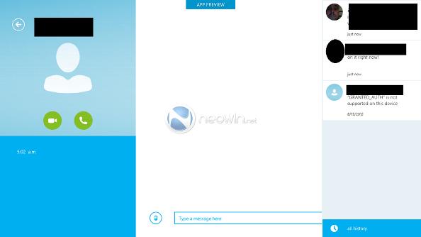
Neowin has had a chance to place its hands on the Modern UI preview and is claiming that the new interface is quite intuitive, stable and fast, despite being a pre-release copy. Whilst we don't currently have a hands-on video to clarify the points on stability and speed, for Skype's new look, take a peak at some of Neowin's screenshots for yourself:
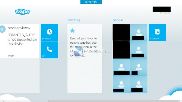
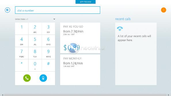
Skype for Windows 8 Modern UI

Skype for Windows 8 Modern UI

Skype for Windows 8 Modern UI

Undeniably, from an initial outlook, the new interface feels clean and logical, good job Skype team! We wonder if Microsoft also has any redesign plans for the desktop client and how such plans might fit-in with the look of Office 2013.

With the push for enhanced Skype integration in Windows 8, we wonder how other voice service providers, such as Google and its Talk client, will respond. We already know that the firm has been working on making Chrome Windows 8 Modern UI friendly, will it do the same for its other software? In fact, with the Modern UI supporting HTML5, could we even be seeing a fully-functional Google Docs app?


HEXUS Forums :: 34 Comments

Login with Forum Account

Don't have an account? Register today!
and no longer written with Qt no doubt. :(
Given how awful the Skype UI is in general (particularly on OS X where it seems to take up most of the screen), I'd have thought anything would be an improvement.

Let's hope they also make it easier to shut down. Yes, believe it or not Skype, I actually know when I want to turn you off.
Shame about those black boxes, they ruin it a bit :P
Fraz
Given how awful the Skype UI is in general (particularly on OS X where it seems to take up most of the screen), I'd have thought anything would be an improvement.

Let's hope they also make it easier to shut down. Yes, believe it or not Skype, I actually know when I want to turn you off.
Given Microsoft's recent history of making Windows itself difficult to shutdown, they'll probably make you do an 11-finger gesture to close it.
this_is_gav
Given Microsoft's recent history of making Windows itself difficult to shutdown, they'll probably make you do an 11-finger gesture to close it.
Both hands and a nose butt? :lol: