As part of Microsoft's never ending stream of openness into its design decisions behind the various elements to be found in Windows 8, the firm has released a blog post detailing the workings of the Windows 8 touch keyboard.
For those who've used smartphone on-screen keyboards, you'd know that, from keyboard to keyboard, there's varying degrees of underlying magic taking place to ensure that the correct key is hit, compensating for the lack of feedback and guiding of physical keys offered by a glass panel. Most obvious, perhaps, is how Apple always assumes that when you touch a key, you actually intended to touch a slightly higher position than you did, thanks in part to the fact that the middle of our finger tip lands before the pointy end.
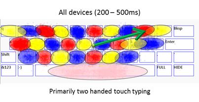
Microsoft appears to have spent a lot of time on this matter as well, though, rather than follow by example, undertook a full start-to-finish research study, attempting to avoid any preconceptions. The firm first noted that there were three common positions when it came to holding a tablet:
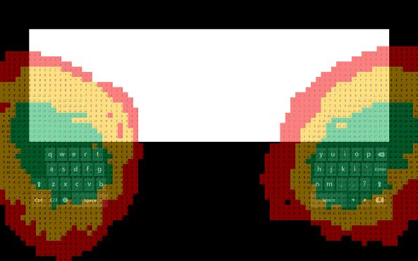
- Two hands holding the device, with thumbs interacting
- One hand holding the device, with one hand interacting with the user interface
- Resting the device on table, lap, or stand, and interacting with both hands
The latter two forms are perfectly compatible with a standard keyboard layout, however for the first form, Microsoft introduced a thumb keyboard, which simply splits the standard qwerty keyboard in two, allowing it to be scaled into the comfort zone reachable by each thumb in the corner of the device, adjustable to various hand sizes.
When it came to the standard qwerty keyboard, the firm has taken into account the fact that on glass, we're simply not as good. Attempting to provide some form of feedback, Microsoft has opted for changing the colour of a pressed key and playing what it calls a "residual" sound, one where its presence is typically noted only by its absence. The firm actually opted away from haptic feedback, stating that in trials, it was often annoying and could been viewed as much of a punishment as a reward for hitting the correct key. For the sake of battery life, this finding is perhaps a rather handy one too.
For coping with our sloppy typing despite feedback, the Windows 8 will instigate a system that takes two approaches to determine which key we actually meant to press and, combines the two for an overall result. The first method will look at common typing habits, how our fingers are at angles when hitting certain keys and our average typing speed to determine ambiguous zones, calculating the probability that we intended to hit a different key. This is then combined with a second method, which looks at common words and what was most likely to have been typed to make the final decision.

To be clear, if you hit keys bang on, Windows 8 will always listen to this input, however if a key is missed slightly or a finger drifts, it'll use its best judgement. This enables us to perform everyday typing whilst paying limited attention to the keyboard, however, when there's a particular word that stands out, it's possible to pay a little more attention, ensure the correct keys are hit and avoid having to make a correction, though, for the vast majority of times, unless you're very unlucky and the word you're typing is similar to another you could have typed, the auto-correction system won't kick-in regardless.

The keyboard itself has received a make-over. Microsoft decided from years of research that keys had to be 19mm and that the keyboard couldn't cover more than half the screen. From this the firm was constrained to four rows of keys on a 10.6in tablet, removing numbers from the default layout. These can now be found with a numbers and symbols shortcut in the bottom left of the keyboard. Interestingly, Microsoft has opted for a number-pad where the 1 is found in the top-left as opposed to the reverse layout typical on most keyboards. This does make a little sense, however, as we've become perhaps much more familiar with the layout on smartphones and ATMs, whilst many keyboards no longer feature a number-pad.

Making the most of a touch-panel display, it's now possible to tap-and-hold to quickly navigate to alternate characters. It's perhaps worth noting the presence of an emote shortcut "emoji" and, most importantly, a shortcut to adjust the keyboard layout, with Microsoft continuing to offer a full standard keyboard for desktop compatibility.
Quite the interesting read and, perhaps a good job Microsoft?


