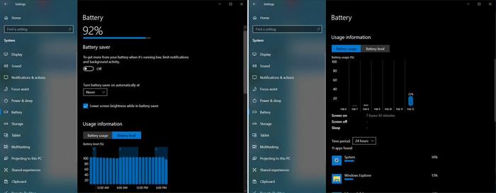
Microsoft recently released Windows 10 Insider build 21313, and it has been discovered that the release contains some new in-development Battery settings pages. These extra settings need to be toggled on to work and then collect battery usage states over a period before the charts and other insights become useful. Of course this extra detail will be only of use to battery-packing PCs like laptops and tablets.
Click to zoom images
Twitterer Albacore seems to have been the first to unearth these changes in Build 21313. Bleeping Computer wrote up his findings and included a guide to turning on the extra battery stats – as they are currently hidden from being accessible, even in this 'Dev channel' Windows Insider build. Example settings pages can be seen above, offering much more detail about battery level and usage than I see on my up-to-date Windows 10 laptop.
Sun Valley update
One of the major and most noticeable changes in the upcoming Windows 10 update (version 21H2), scheduled for October, will be the first major UI refresh for Windows 10, dubbed Sun Valley. The new "sweeping visual rejuvenation of Windows," includes a new UI that leverages Microsoft's Fluent design language.

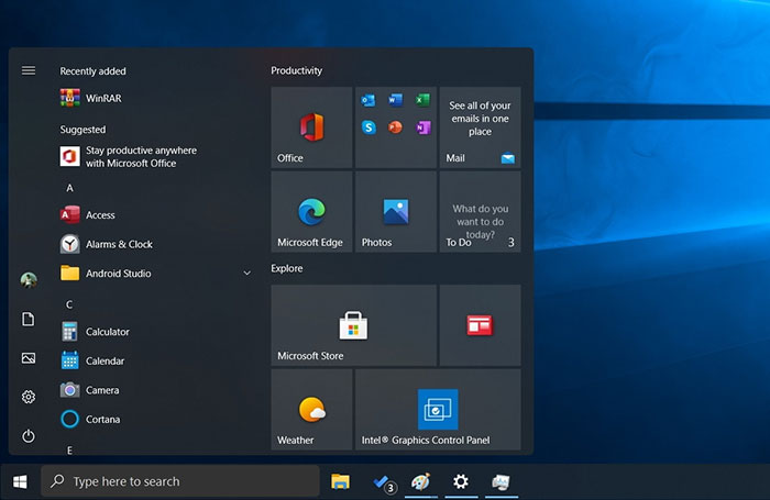
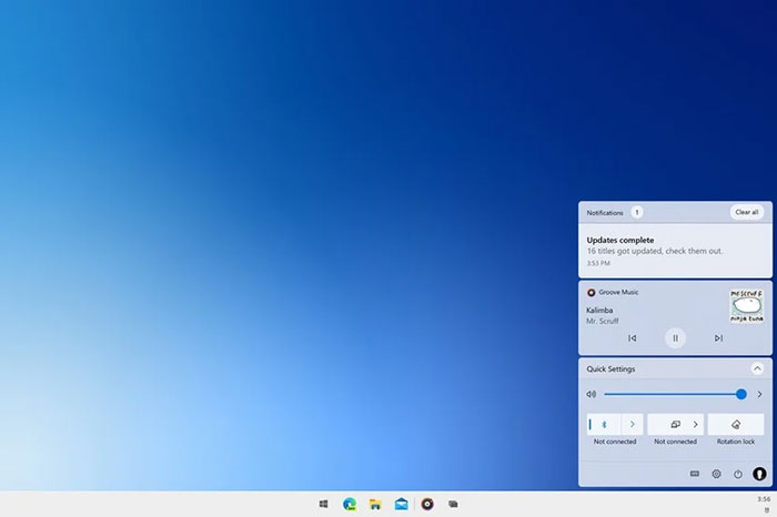
Microsoft's preview builds of Windows 10X saw the firm introduce floating menus and rounded corners extensively and this seems to be one of the main changes you will see come to Sun Valley. To see how this might look, I've shared a screen from Windows Latest, above, and another from Windows Central, below.

The above images are based upon various sources, leaks, and Microsoft's own screenshots but are 'artists impressions'. As well as floating windows and rounded corners, theme-aware live tiles are expected to appear with Sun Valley's UI refresh.


