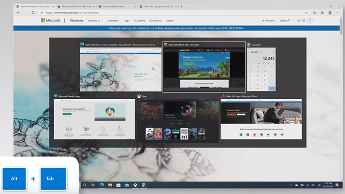
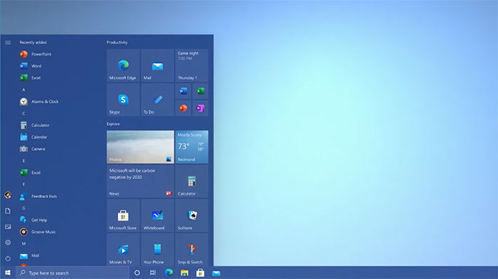
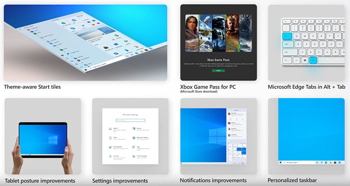
Microsoft has started rolling out Microsoft Windows 10 version 20H2 to users. It isn't a very major update in terms of features. In brief it is the first version of Windows to ship with the Chromium-based Edge browser, as you alt-tab through windows you will notice that it skips through browser tabs too, and the Start Menu has had a visual makeover which is most obvious in Light app mode.
You might notice the new version number is of a different format to previous releases. Microsoft used to make the version number by mixing the 20XX year digits with the month of RTM. Previous versions carried version number such as 2004, 1909, and 1903.
The new Microsoft Edge based upon the Chromium code ships as standard with 20H2. Microsoft asserts this is "a better browser with more performance, more privacy and more value," and that it has been adding new features every six weeks since launch. It takes the time to highlight one of the newest additions to Edge - Collections. This feature helps browser users save and share content they find online. It is handy for tasks such as holiday shopping, school research, or planning a trip, says Microsoft. It syncs across all your PCs and mobile and is a bit like Firefox Pocket.
Some UI features that will be welcome to Edge users are; being able to Alt-Tab through your apps and Edge windows, being able to mouse-hover over a website shortcut icon in the taskbar to see all the open tabs for that site.

Another change which will be highly evident to many users is the new streamlined design of the Start Menu. Microsoft says that "a uniform, partially transparent background to the tiles creates a beautiful stage for the redesigned app icons like Calculator, Mail and Calendar." You can toggle between light and dark modes too, with the ability to add a colour accent. Start Tiles are affected by the colour/shading changes too. We saw these Start Menu changes tested in Insider Preview 20161.

Some other tweaks include; the easily accessible refresh rate adjustment as we saw tested in Insider Preview 20236 recently, 2-in-1 mode changes with fewer interruptions from the UI, notifications popping up from the system tray now let you know where they come from via app icon and name, and Microsoft promises a cleaner, more personalized, out-of-box experience for account creation or first-login users.

Microsoft is throttling availability over the coming weeks to ease its server burden. Additionally some devices might have a hold in place for compatibility issues. If you want to press ahead and get the update ASAP you can open Windows Settings and navigate to Update & Security > Windows Update, and select Check for updates. Microsoft has a dedicated page about getting the latest update here.


