Yesterday Microsoft pushed out a Canary Build version of Windows (version 18947) to Windows Insiders on both Fast and Slow rings. This was an accidental immature release, not intended for public consumption (even Insiders), and may include features that have yet to be announced by Microsoft. One of the most startling changes, witnessed by Insiders that went ahead and installed this release in recent hours, was the change in the Windows 10 UI.

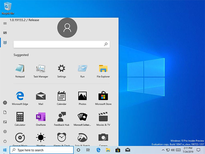
The Verge reports that the Windows 10 build 18947 build was meant for internal Xbox development only. Startlingly it features a new Start menu without any Live Tiles present. Instead you see a search bar at the top, with suggested apps beneath, followed by a grid of app icons. The look is rather different from the colourful Start Menu we have now in Windows 10. Its misaligned user icon, washed out colours, and the ungainly mix of colour and mono icons doesn't make it look any better.
The new Start Menu appearance might be a sign of things to come in Windows 10 in general, or it might just be a new Windows Lite appearance style that has been turned on by default. We simply don't know if the new start menu style seen in Windows Lite screenshots is going to be present, or an option, in regular Windows 10.

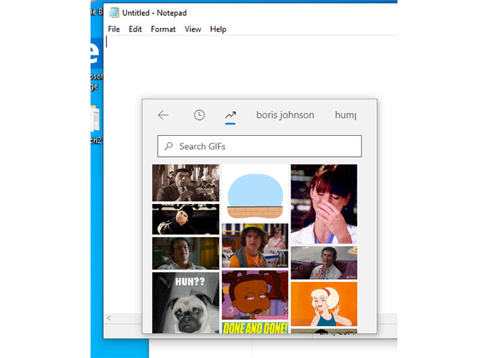
Another introduction in this build, noted by various sites that tested it, is a GIF search tool inside the Windows 10 insert emoji panel. This is not a killer feature in my estimation.
Whether you are interested in the new Start Menu or not, it is troubling that Microsoft can accidentally push out such an immature Windows 10 build to a wide section of the willing public. Windows Insiders know there are 'risks' - but even the Slow Ring folk, who opted for an additional measure of caution, got sent this release by accident.


