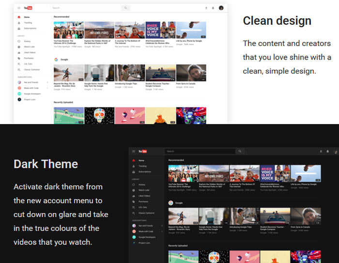
YouTube continues to roll out site redesigns. Sometimes you might not notice any difference. However, there's a new design on the way with a difference as easy to see as black and white, as night and day. Yes, you've guessed it, YouTube developers will be delivering an easily switchable dark mode to the masses in the not-too-distant future.

The new design was opened up to the public yesterday via a link provided by the YouTube blog. Leveraging Google's Material Design to YouTube on desktop browsers, the designers aimed to achieve three key goals; simplicity, consistency, and beauty.

In a bit of technical background YouTube said that the new look site is built "on a new, faster framework named Polymer, which enables quicker feature development from here on out". The new Polymer: Dark Theme is one of the first fruits of leveraging the new framework. It is explained that the Dark Theme turns your background dark throughout your entire YouTube experience and was developed "to cut down on glare and let you take in the true colours of the videos you watch".

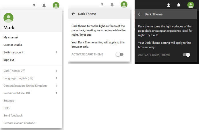
If you are interested in trying out the redesigned YouTube you can head on over to youtube.com/new and opt in by clicking the 'Try it now' button'. To switch to the Dark Theme mouse your mouse pointer to the upper right and click on your circular user icon. A menu pops up and you will see 'Dark Theme: off' about half way down. Click the chevron to open a new menu where there's a toggle for the 'dark mode'. Later, if you get bored or otherwise dislike the new look YouTube in either of its new light or dark themes, you can 'Restore classic YouTube' from the same initial menu.

A few weeks ago I read with interest about switching to YouTube Dark Mode but the solution seemed to be a bit fiddly and to require use of the Google Chrome browser which I don't use as my mainstay. The above Polymer: Dark Theme works fine in Firefox on the desktop.


