Visually Appealing
Sitting in a black and gunmetal casing the M500 is all screen, its vast expanse of 65,000 colours that dominates the overall appearance of the handset with just a small collection of buttons appearing down the bottom of the device facia. The crisp 44mm x 58mm screen features a touch screen interface that’s controlled using the sleekly integrated, slide out stylus. Alongside the stylus housing is the small power button for the device and further down that side is the infra-red port.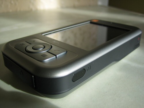
Flipping over the phone reveals the M500 is packing a 1.3 mega pixel camera and a-la Sony Ericsson there is a ‘oh look at me’ mirror built into the back of the device.
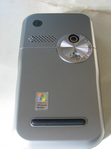
The more I look at the device, the more I think it has styling and ergonomic layouts influenced by the main players, Nokia and Sony Ericsson. The camera for example, can be activated using the button on the left hand side of the handset, exactly like the recently reviewed K750i
In saying that though, there are a few more buttons on that edge, the ubiquitous volume control slider, but the second button on there is the voice dial activation. Now the observant amongst you will notice there has been no mention of dial pads, or any significant number of buttons. There is a reason for this, there are none; the dial pad is actually the touch screen, so voice dialling all of a sudden becomes a very valuable addition. Not only that, but for those of you that have ever had to do the tortuous Microsoft office Voice Recognition configuration will be pleased to hear I switched on the handset, read out a number and not a single letter made it, numbers were all it heard and it was 100% right, impressive stuff.
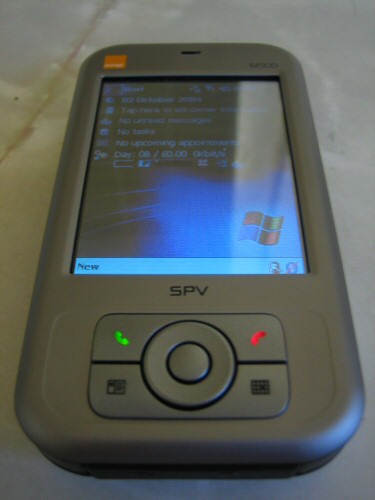
Now we come to the front of the device; there are a few buttons located around a central button and four way navigation circle, not too reminiscent of the, now infamous iPOD touch navigation, and why not, it’s simple and effective. The top button is your simple ‘make and hang up’ call button in the traditional green and red hue appropriately. The underside of the navigation circle sees the bottom button allowing navigation to the contacts and calendar applications.
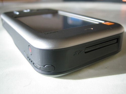
The top edge of the device leads to the easily accessible, Secure Digital based, additional memory slot. I say easily accessible, at least unlike other manufacturers this isn’t hidden under the battery, but at the same time, you have to use the stylus to get the SD card holder out of the device. Yes you heard correctly, this device ships with a blank plastic holder card in the SD card slot, a severe disappointment considering this handset is currently charged at £100 from Orange direct based on a £30 contract, although go to a reseller, I know for a fact you will get a better deal.
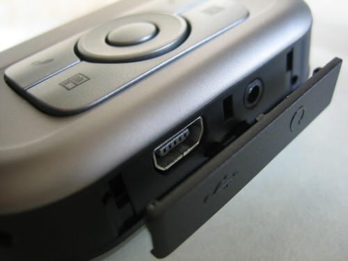
The bottom edge of the device has a rubber cover hiding the USB port and the standard audio jack socket. The charging on this device can either be done through the included USB cable or the 3 pin plug adapter cable, that, usefully also uses the USB socket at the bottom of the device. The ability to charge up from any USB socket is a feature that really should exist on other mobile phones; it just makes economic and practical sense given the flexibility it gives you and the ability to charge on the go, anywhere, worldwide without carrying a mass of different adapters on your travels round the world.


