facebook rss twitter

Sky continues progressive roll out of high-def EPG

by Parm Mann on 6 April 2009, 14:52

Tags: Sky+HD

Quick Link: HEXUS.net/qarrb

Add to My Vault: x

BSkyB has announced that it will this week continue to roll out its all-new electronic programming guide (EPG) to long-standing subscribers of its premium Sky+HD service.

The upgraded and long-awaited EPG was first deployed to select customers early last month, and will continue to be made available progressively in the build up to a nationwide launch later this year.
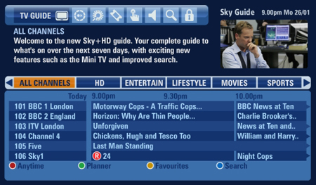
Following years of development, the new Sky+HD EPG is designed for high-resolution displays and is able to display more information on a single page.

Whilst remaining familiar with Sky's trademark shades of blue, the guide now displays a small video of the current channel - allowing viewers to see what else is on or make changes to their recording schedule without disrupting their viewing.

Elsewhere, recorded series are now grouped together in Sky's planner and the upgraded mini guide can now detail now, next and later programming information for up to 12 hours.

In addition to a number of other usability enhancements, the new EPG also sports high-definition text and graphics, ensuring a crisper-than-ever guide experience.

Although visually impressive, it may take Sky+HD subscribers some time to adjust as the current EPG hasn't been revamped for the best part of a decade. Have you been upgraded to the Sky+HD EPG? If so, share your thoughts in the HEXUS.community forums.


HEXUS Forums :: 25 Comments

Login with Forum Account

Don't have an account? Register today!
Whilst remaining familiar with Sky's trademark shades of blue, the guide now displays a small video of the current channel - allowing viewers to see what else is on or make changes to their recording schedule without disrupting their viewing.
If I was a Sky subscriber, this alone would make me upgrade to an HD box :)
Funkstar
If I was a Sky subscriber, this alone would make me upgrade to an HD box :)
Thats because you've not used it.

Sky has far too many channels of utter **** that you need to page through, this makes it much harder because only 50% of the screen is used. You can't seam to change that.

The menu system suffers from aspirations of greatness, it tries to be smooth and cool, this means it takes a long time, even moving time with the search and scan banner, they added this fade slide animation, purely to make it take longer.
it's just something i really miss from my MP system whenever I use a Sky box. I hate their standard EPG.
Its just to damn slow, you have only 6 rows of infomation :(

If they had 1080p hardware there, using say 25% of the screen for the Title and Picture, then 75% of the screen for the program listings it would of been really good. But no, no they didn't.
The new EPG is a mixed bag.

Some of the new features are awesome and make things much better (current channel viewable in guide, grouped recordings, search facility, ITVHD available via manual tuning, “further info” works via the banner, FF/RW now works properly)

But….it is a bit clunky :S Not being able to scroll up from the top item to appear at the bottom of lists, plus navigating via up/down/left/right to get to the various sections is a real pain.

There was no reasons that I could see why the good features could not have been added to the old “non clunky” system :(