Just a little small-change, perhaps?
The week that I decided to unveil my creation, the media was full of stories about how we must all stop travelling abroad, or anywhere, because of global warming!
Clearly this was not the ideal time to be launching a site extolling the virtues of travelling to Europe for the day.
Air travel came in for most public criticism, with report after report suggesting that aviation was the biggest single threat to civilisation since the invention of the atomic bomb.
Was it just me or did anyone else spot the irony of journalists flying all over the world to report on how flying all over the world was causing global warming?
At this point I contemplated shelving the project. But after carrying out some research, I felt much less guilty. I discovered that the UK contributes less than two per cent of all global carbon emissions and air travel less than five per cent.
Industry, domestic heating and power and motor transport all individually account for far higher percentages than aviation.
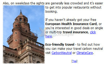
But it wasn't until I found out about carbon offsetting that I felt I could launch the site with a clear conscience. Offsetting companies work out how much CO2 a journey creates, levy a charge against the traveller – around £3 to £5 for a flight to Europe – and put the money into different projects around the world that neutralize the carbon footprint of that journey.

Get your health card and be
carbon-neutral
Although the media was again full of global-warming stories, I did finally launch daytripstoeurope in October 2006 - complete with carbon-offsetting links and four city guides (there are seven today, with more on the way).
And I even sent out my press release because I no longer felt like I was promoting germ-warfare kits. I needn't have worried though - more or less all the press ignored my release and the site.
However, one or two journalists, no doubt by complete coincidence, very soon after came up with the clever idea of writing articles about day-tripping to Europe!
In the absence of any publicity, search engines suddenly became critically important, as they were now the only way that anyone could find the site.
A lot has been written about how to get a site onto that crucial first page of search results, and the impact of meta-tagging, key-words on the page (and how early they appear) and key-word repetition – and the varying importance that different engines attach to them.
Some liken the process to a science, others think it's more like a black art. What I find works best is a little bit of everything – key-words as meta-tags and located high up in the text of a page, along with a little bit of repetition.
But more important than where you put the key-words are the words themselves. Spend time thinking about all the words and phrases that people might use to find your site - including common spelling errors.
Experiment with your key-words in different search engines and see what each throws up. Doing that will almost certainly highlight some words that you haven't thought of and illustrate the importance of the first three or four search-words.
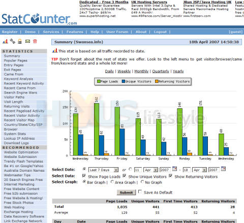
Then use a web-statistics gatherer such as statcounter.com. This will not only help refine your key words by telling you which have been used to find your site but also give you lots of other useful information, such as what countries your visitors are coming from, what browsers they're using and how long they were on the site.
Click for larger image
Statcounter is free and you can put a counter (visible or invisible) on any page you want to collect statistics. At the moment, I have just one - on my home page - but as visitor numbers go up, I may want to put counters on other pages.
When Nietzsche said "that which does not kill us, makes us stronger", he'd obviously never built a web site. If he had, he probably would have written, "that which does not kill us, can occasionally induce paranoia leading to a persistent vegetative state".
So why am I still doing it? Well, I do believe it was an original idea for a travel site – and I know that I would have made regular use of such a site if I'd ever been able to find one.
Then there's the simple truth that I enjoy travelling. Checking out amazing cities for the site has been no kind of chore at all.
And, although I'd like to pretend it's all about the art and the travel, it would be nice to think that the site might be able to make me some money one day.
Finally, I've always wanted somewhere to stick my travel photographs – other than a shoebox – and my own site lets me share them.
It's not been an easy ride but it's one that I've enjoyed (mostly) and has been worthwhile going on/
Check out John's little baby, then tell us in the HEXUS.community about your own experiences creating web sites.
HEXUS.links
HEXUS.community :: discussion thread about this articleExternal.links
daytripstoeurope.co.uk - home pageNamo - home page
Rick Maybury - BootLog
statcounter.com - home page


