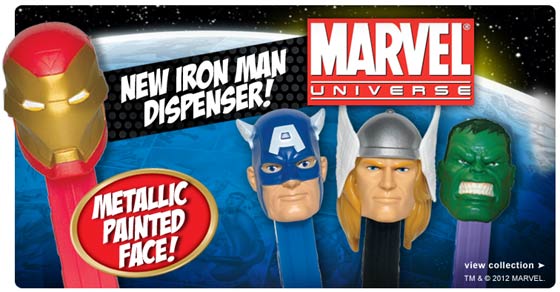
eBay is the world’s largest online marketplace and has a customer base of an amazing 233 million people. The company was founded in 1995 by Pierre Omidyar to help his now wife buy, sell and trade her Pez Dispenser collection. Only now, after 17 years of unflickering dedication to the old multi-colour jumble of letters, the company has plumped for a new logo design.

Brief: type it in, tweak kerning to make letters touch, keep same colours.
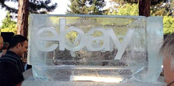
The new logo reflects the company’s “transformation from start-up auction site to multi-billion dollar operation” according to Creative Review. The typeface used in the new logo is Univers 53 Extended but tightly kerned and, unlike the original, all the letters adhere to the same baseline.
eBay said in a statement, announcing and proudly showing off the new logo “Today we’re creating the future again. We’ve been building the new eBay. And today, we’re proud to introduce a new look for the eBay brand.” Echoing the Creative Review feeling that the new logo is one of a more mature organisation, the eBay statement says the refreshed logo reflects the online store’s “cleaner, more contemporary and consistent experience”.


The time felt right
It takes time to develop a memorable brand and changing the logo of an established well known brand is “not a decision made lightly” according to David Wenig, eBay President. eBay say that the decision to change the logo now was taken because “The time felt right.”

eBay's cool new logo?
Microsoft also recently updated its logo prior to a tidal wave of upcoming new software and hardware releases. A re-design met mostly with approval by HEXUS readers. The new eBay logo isn’t on the eBay site live right now but will be up there in mid-October and used in advertising and marketing campaigns thereafter.
Is the new eBay logo an improvement?


