Write move
Back at Nokia World last September, Nokia was at its most defensive about its way of doing things. The Elop announcement had only just happened and Nokia lifers, from Anssi Vanjoki downwards, were stamping about the ExCeL in a state of righteous indignation about how wrong everyone was to criticise Nokia's efforts in the smartphone market.
The N8 and E7 were positioned as the handsets to prove everyone wrong, and Nokia execs seemed unaware of the irony of defending their way of doing things at a conference with the unofficial theme of ‘Nokia is back'.
Inevitably Symbian was the topic that kept cropping up and one of the things we remember several Nokia people getting prickly about was the font. But Nokia deliberately uses a specific font called Nokia Sans on nearly everything is does: corporate stuff, marketing and, yes, even software. In our subsequent review of the N8 we remarked that the retro font is off-putting, whether Nokia likes it or not.
Six months down the line it's clear that a big reason the Nokia board appointed Stephen Elop, rather than Anssi Vanjoki or some other Finnish Nokia lifer, was that it realise things had to change, fundamentally. In retrospect, the defensiveness we observed was symptomatic of a company-wide malaise that only new blood at the top could rectify.
Of course the big change has been the move to Windows Phone 7 - effectively abandoning two in-house platforms: Symbian and MeeGo. But perhaps more symbolic of Elop's drive to change Nokia's culture is a change in its corporate font, precisely because Nokia has chosen to make that font such an integral part of its self image.
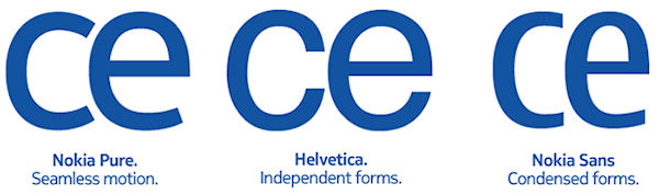
So out goes Nokia Sans and in comes Nokia Pure, which seems to be a cross between the old font and good old Helvetica. But don't let Bruno Maag - the typographic designer Nokia employed to create this new font - hear you referring to it in such prosaic terms.
"It was a balancing act," Maag told Nokia's branding blog (yes, it has a branding blog). "An elegantly simple typeface that doesn't draw attention to itself, but is still distinctive and different. For me, it's the rhythm of the typeface and the relationship between characters that's critical. After all, when it's set in Arabic, you still need to know that it's Nokia, and this is achieved by creating a recognisable rhythm."
But Maag was quick to get to the crux of the matter: "First and foremost, the typeface is extremely legible wherever you happen to see it," he said. "Nokia Pure is contemporary without being fashionable, which should give it longevity. It's one thing drawing a beautiful letter, but another making a whole set work to a high quality. A coherent typeface is an essential part of a coherent branding strategy."
While many may struggle to see how a typeface can be imbued with characteristics such as rhythm and coherence, most people would probably agree that Nokia is in need of an image overhaul. While, of course, that will most effectively be achieved by launching a kick-ass smartphone, a new font is a step in the right direction.