Installation
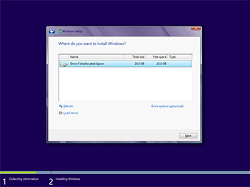
The bulk of our multi-part review will focus on Windows 8 on the desktop; it's where the majority of the HEXUS team spend their time. Before we get onto our hands-on impressions, let's take a look at the install process (which, as you know, can be carried out quickly from a USB thumb drive).
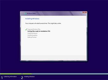
What's interesting here is that the installation screens evolve throughout the process. They start with familiar-looking windows and drop-down menus, and by the end of it all, these windows are replaced with a large, full-screen interface - a sign of things to come.
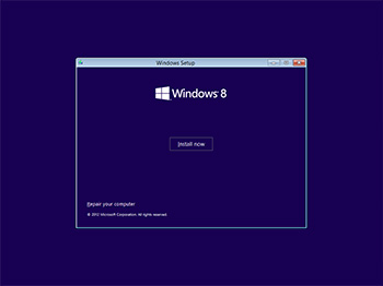
The first couple of steps are almost identical to Windows 7, save for a new logo. For Windows 8, Microsoft is using a logo designed by Paula Scher from the Pentagram design agency. It's essentially a four-paned window that's tilted in perspective, and it's a logo you'll see adorning numerous hardware devices in the coming months.
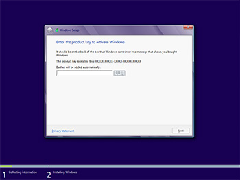
The next couple of steps are simple enough, but there is one big change that could be easily overlooked. Unlike Windows 7, Microsoft doesn't allow users to install Windows 8 for a free trial period. You need a product key to get past the fifth step and proceed to the terms and conditions.
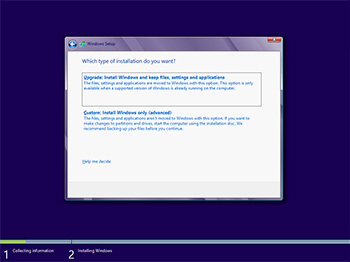
Reiterating the fact that Windows 8 is built on the core of Windows 7, this install process looks awfully familiar. Once again, we recommend the clean 'custom' install, but users wanting to retain files, settings or applications are given the choice to do so. Again, how much you can carry over will depend on the version of Windows you're coming from, and the setup utility will state which options are available.
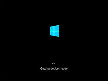
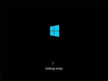
We like to think of this stage as goodbye, desktop, hello, Modern UI, as after restarting the system, the Windows 8 install resumes with a fresh new look and feel. Being pernickety, we're not sure why Microsoft feels the need to keep repeating the 'getting ready' message. It's installing, we know that already.
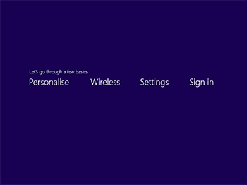
Straight away, the Modern UI feels unusual. The first screen - 'Let's go through a few basics' - seems as though it's presenting four choices for you to click on, but it's not, you just wait a moment and it automatically moves on to the first step, Personalise.
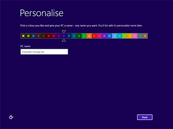
Strangely, the Personalise stage provides only two options; the ability to change colour scheme and the requirement to name the PC. The Wireless stage doesn't show on systems without Wi-Fi (our desktop's using a wired connection), so that takes us straight to Settings. In this menu, Microsoft's recommended express settings state that updates will be automatically installed, Internet Explorer will run with Do Not Track enabled and usage data will automatically be sent to Microsoft. Each of these settings is easily changed using the customise tab.
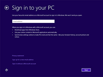
This is new. We can't remember any previous Windows asking us to sign in with a Microsoft account, but the prompt is loud and clear. Microsoft's vision of a cloud-connected future entails every Windows user being registered, which in turn allows apps to be downloaded from the Windows Store, and settings to be synchronised between devices.
We'll discuss the benefits of using a Microsoft account later in the review, but here's the bit many of you will want to hear; you don't need a Microsoft account to run Windows 8. If you prefer, choose the 'sign in without a Microsoft account' link that's placed far less prominently at the bottom of the page.
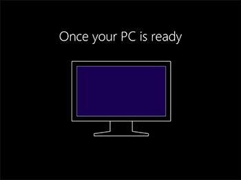
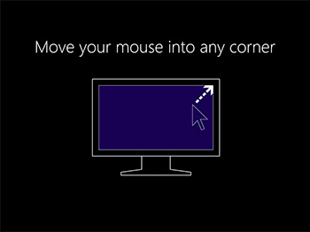
The next couple of screens hint at the fact that Windows 8 isn't the Windows you're accustomed to. In an effort to point consumers in the right direction, Microsoft's all-too-brief illustration suggests moving the mouse into any corner will act as a logical starting point.
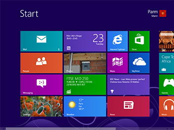
Trouble is, it is only that; a starting point. The Modern UI adorning the Windows 8 Start screen is so different that many users will initially feel lost, and a thorough demonstration - or better still, a video detailing the new interface - should be here to help newcomers get accustomed to navigating Windows 8.
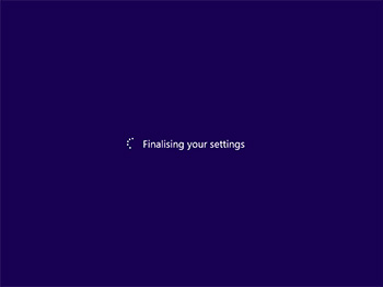
Instead, Windows 8 gets the PC ready, installs apps and then throws you into the deep end by displaying a Windows interface that's a complete departure to every previous release.


