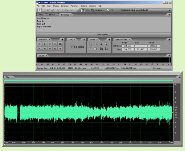
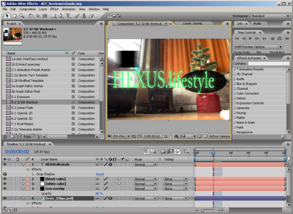
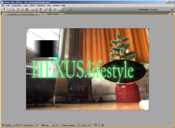
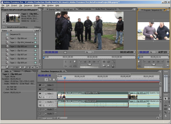
Not just a pretty interface (1)
For users of the suite who don't work in professional broadcast or film production - and, indeed for pros - some of the very best news is about the improved ergonomics offered by the four updated suite members. When you first run Premiere 2.0, AE 7, Encore DVD 2.0 or Audition 2.0, the thing you're most likely to notice is the new-look GUI – and, although this has softer lines and can have its brightness changed independently of the operating system, it isn't just a pretty interface.
Because the four programs are developed by different teams that haven't yet managed to quite synch up with one another, the GUI isn't identical in its operation across all four. Even so, it does share a number of common features that aren't found with the two other main suite members, Photoshop CS2 and Illustrator CS2, which pre-date them.
First, each window (Adobe calls them Panels) automatically rescales as you resize the interface. So, unlike Photoshop CS2 and Illustrator CS2 - which still work in a more Mac-like way - if you change any of the four updated programs from being full-screen to something smaller, you won't leave a whole bunch of palettes and tool-bars floating freely on Windows XP's desktop (or Mac OS X's, in the case of After Effects, which is the only one of the four newcomers that runs on both OSs).
Instead, palettes and toolbars shrink proportionally and stay in their original positions within the main interface's border.
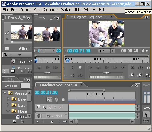 Shrunken Premiere interface shown
1:1. Okay, it's not
 practical to work when the interface is this small
but the shot does nicely show that the different
windows within rescale as you shrink the GUI
At this point, anyone who uses – and takes full advantage of – a multi-monitor display would be forgiven for starting to panic. Happily, though, with the new interface, it is still possible to undock windows, resize them individually, move them to a second screen or spread them across two screens.
This is the sort of thing than many editors like to do or, rather, have to do, because it can be hard to work efficiently with the clutter you typically get when running a multi-window program on a single screen.
Some editors even like to have a permanent, highly detailed, view of the timeline and achieve that by spreading it out right along the bottom or top of the two screens.
Well, none of that is a problem with the new interface. Better still, there are some tricks up the collective sleeve of the four updated suite members that, perhaps for the first time, will allow many Adobe-using video editors, special-effect artists and DVD authors to feel comfortable working on a single monitor. Of course, it's not hard to get comfortable working on one single, very large monitor but they still tend to be expensive compared to the cost of two more modest-size monitors.
The best of the tricks is the ability – by pressing the reverse apostrophe key (the one that sits above the tab key on a full-size keyboard) – to have the active window within the interface immediately become full-screen. Press it again and the interface reverts to its normal multi-pane view.
As you can see, that means it's possible, instantly, to get highly detailed views of any window - and you can toggle right back again, instantly, too. Unfortunately, although the shortcut to activate this feature worked well in our betas of AE7 and Audition 2.0, it didn't work at all in Premiere Pro 2.0 or Encore DVD 2.0, which, we guess, were finished before the other two (or had to be wrapped up as jobs-still-in-progress because the others were finished).
This full-interface zooming with a single key press is a great feature and we'd like to think that release versions of Encore and Premiere will have it. But, we'd guess that, in Premiere, it will only be arriving in a point-revision version – though whether that will be free or paid for, we don't know.
So, why do we say that video editors and DVD authors are going to be happier now working on a single monitor when the apostrophe-zoom option isn't available to them yet?
Well, in the case of Encore DVD, it's partly because there's another way of achieving the same result, which we'll come to in good time. And, in the case of Premiere, it's because there's another up-the-sleeve trick – one that's actually implemented across all four new apps.
If you think of the apostrophe-zoom as automagic resizing, this trick is a semi-auto version. It allows you to drag out the active window so that it fills about three-quarters of Premiere's interface and rather more in the others programs.
As this happens, the rest of the windows in the interface automatically shrink to make room. Conversely, you can make one window much bigger by making another one much smaller.
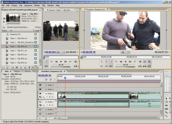
So if, say, you want a detailed preview of a clip in Premiere's bin, you can resize the source monitor window just by make it active with a click, grabbing any edge or a corner and dragging it out.
Similarly, where a suite-member has a multi-track timeline, it can be dragged out bigger to let you see a whole bunch of tracks in detail, not just one or two - and without everything else totally disappearing as happens using the apostrophe-zoom method.
And, of course, the same trick works with other stuff you'd like to see quickly expanded, including long lists of effects, a big selection of DVD menu-creation templates and a whole bunch of files in clip-bins.
Grabbing a drag-point, especially a corner, can be fiddly, though, and this way of resizing, as we said, works less well in Premiere than in its three companions. Premiere's timeline, for example, didn't shrink as much as we'd have wanted it to when increasing the size of the timeline monitor or source monitor to get a better look at a video clip playing.
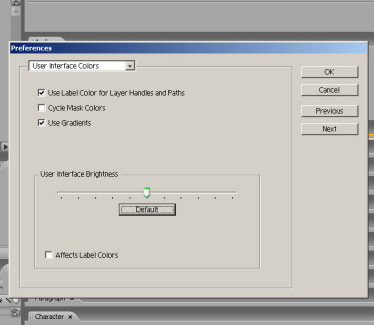
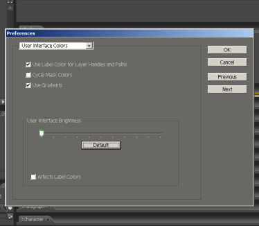
But, as the screengrabs above clearly show, this is still a useful and welcome option, even in Premiere. What they also show is that it's possible to control the brightness of Premiere's interface to suit personal tastes or the working environment. This is set using a slider bar in the Preferences dialogue box and is also possible within After Effects, Audition and Encore DVD - and set in the same place.
Changing the brightness affects panels, windows and dialogue boxes but not scroll bars, title bars and menus that aren’t inside panels or inside the application background.
Many heavy-duty video and effects programs tend to have dark backgrounds, so a dark look is thought of as being a professional look. However, there are clear practical advantages of a dark GUI, especially if working in a darkened editing suite or when making colour corrections.


