Notification area and start menu
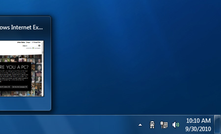
Windows 7's notification area has been subject to something of a clean out. As standard, only four notification icons are visible - action center, power, network, and volume. Any other icon or notification is automatically hidden and must be viewed via the "show hidden icons" button. If, for some reason, you prefer the cluttered notification area of old, each individual icon can be set to hide or show via the control panel.

That slim glass-like panel at the end of the taskbar that you're probably wondering about is the all-new "show desktop", only, it's different, too. In Windows 7, show desktop becomes peek desktop and moving the mouse over the glass panel makes all open windows transparent so you can see through to the desktop. Sounds handy, but we'd like to see a click-to-peek option, as opposed to a mouse over.
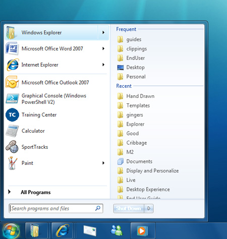
The Windows 7 start menu resembles that of Windows Vista but it has a few noteworthy changes. Folders such as Downloads and Videos can now be easily added to the menu alongside Documents, Pictures, Music and Games, and the Start Menu takes advantage of those all-new Jump Lists, too.
There's no shortage of UI improvements, and it's all coming together to create a visually-impressive OS.


