Graphics
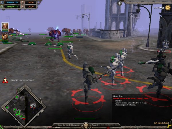
And now a word about the graphics. As I said right at the beginning, the game is very polished and a looks superb on my 9800XT. All the usual graphical touches are in here, with lighting effects, shadows, misting et al all doing a great job of making the game look wonderful. The backdrop you play against, be it open countryside or devastated city, look superb too. If I had to find a fault with the way the game has been drawn it would be that after a while the textures become a bit samey and some of the backgrounds start to look alike. Like I say, those are minor niggles.
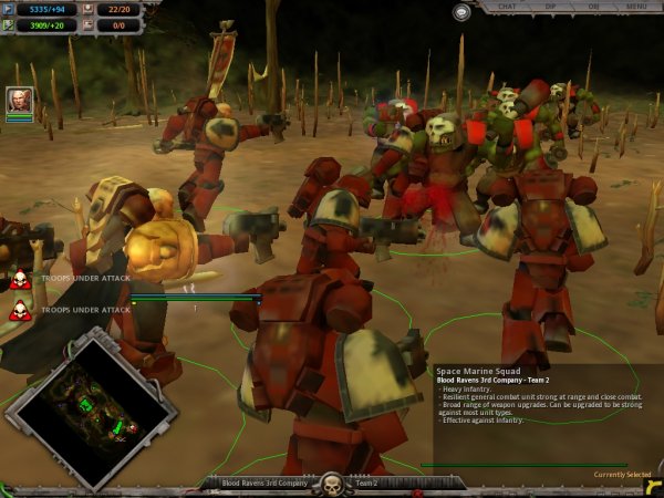
As to your troops themselves, well, what can I say? They’re superbly drawn (if a little blocky and angular) and nicely coloured to add a much needed contrast to the grey devastation they fight in. What’s more, you can customise the uniforms for every side in here and play with that online or in the campaign. So if you’ve the skill with skinning models, you could have a troop of the Village People going up against Boyzone (personally, I’d PAY to see that one!). Each unit is nicely animated too, with troops running, walking and kneeling depending on what they’re up to. Stationary units such as listening posts have nice idle animations and even the buildings have are animated when they’re producing units. In combat things get even better, tank’s turrets move independently, targeting nearby hostiles, soldier engage in hand to hand combat if they’re close enough, heavy guns recoil, the list goes on. Suffice to say that Relic have thought of it and put it in here, nicely done.
But there are a couple of grumbles, well, one grumble and one wish, if I’m honest. First off, the camera, which is very easy to use and gives a beautifully smooth scrolly spinny zoomy view of the world just doesn’t zoom out far enough. The game engine uses the ‘fog of war’ which is great, but it just doesn’t show as far as you can see. You’re forced to stay too close to the action. This is fine when you’re skirmishing in one spot, but when your troops are fighting along a longer front, being able to see that bit further would have been nice. Using the world map to jump small distances isn’t precise enough. Having to scroll up and down the line for, say, two or three screen lengths though not difficult, is a pain in the middle of a firefight. You can use the view controls to look along the ground, as if viewed from the eyes of a trooper, but its difficult to keep a track of how battle is progressing in this view and even easier to get lost in some of the city maps.

That said, being able to get your view down until you’re right on the shoulder of a trooper who is giving the good news to an ork is superb… and here’s where my wish comes in. The game engine can easily handle quick rotations and zooms all over the place. We can zoom right in to see the fluff on a new recruits cheek. Why couldn’t there have been a first person option included too? The engine can easily handle it. Battlezone managed it with aplomb and DoW is crying out for it. Imagine being able to take over a unit and have a go yourself. That’d be fantastic and would really do the game engine justice… but hey, that’s just a wish and in no way detracts from the game.


