Style and content
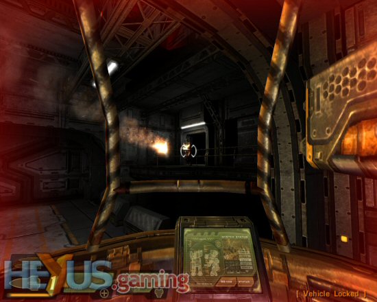
Graphically, if you’ve played Doom 3 you’ll have a very good idea of how Quake 4 looks. Raven have obviously taken a good look at Doom 3 and heeded the criticism levelled at id for Doom 3’s darkness and lack of weapon mounted torch. In fact, I’d even go so far as to say that Raven have taken some of their Aliens vs. Predator experience and applied it to Quake 4 as there’s plenty here to remind you of the Aliens film. When you enter a dark area your squad will flick on their torches and the beam effects look great reminding you of the darker scenes in Aliens… all you need is Hudson freaking out and you’d be there.
 Click for larger image
 Click for larger image
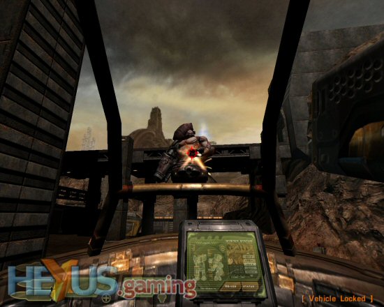
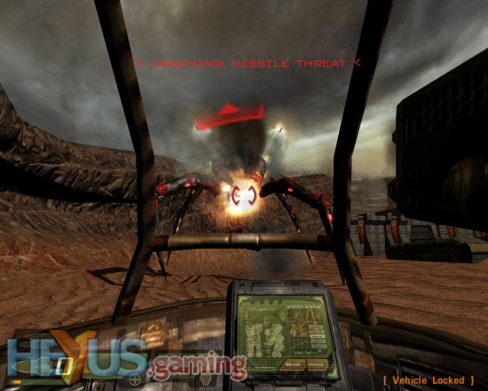
Of course, using the Doom 3 engine, lighting and detail are everything and Quake 4 comes up trumps in that department. This is by far the best rendition of Planet Strogg we’ve seen and thoroughly in keeping with the feel of Quake 2’s version. Strogg soldiers are nicely detailed and animated as are the surroundings. Raven have shown what the Doom 3 engine can do by giving us some large outdoor areas with massive enemies running about in them. Some of these are seriously impressive, all the more so because you don’t expect to see them. So the first time you come across a giant rocket firing spider thing, you’ll have a gasp at how cool it is. And when the Marine’s mothership lands, again you’ll stand there and have a good gawp as these large models are something entirely new for the series.
 Click for larger image
 Click for larger image
It’s not all love and cuddles on the graphics side though as you can’t help but wish for a bit more variety in what you’re seeing. I know that the colour palette is in keeping with the style of the game but after a while it does all start to look a bit samey with lots of brown and greys. This is alleviated somewhat by the explosion effects though, which are nice and colourful and because of the dullish backdrop, they stand out all the more. Sadly, you just can’t help but feel that Quake 4 is the game Doom 3 should have been.
 Click for larger image


