From squares to hexagons
The following review was submitted by Gerrard, one of our regular contributors at HEXUS.gaming. The opinions expressed in this review are his own and not necessarily the views of the HEXUS team.Two series in the recent history of PC gaming have had black hole type abilities to distort time; Championship/Football Manager and Civilization. Today I’ll be talking about the latter series with its newest instalment, Civilization V. This review is based only on an (intense) weekend of playing it but I have wasted many an hour on its predecessors, and there will be a lot of comparisons made to Civ 4. So it’s time to dust off the settlers and workers and get to work on grid-like world. Wait a minute, what’s happened here?
Six vs. Four
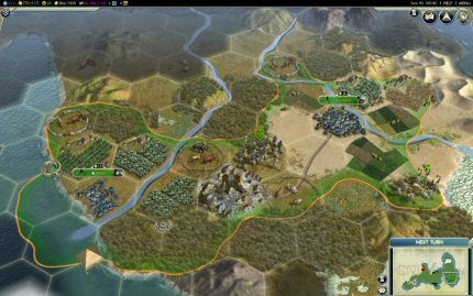
Probably the biggest change made for Civ V is the move from squares to hexagons as the tiles for the world. This is nothing new for turn-based games, and I remember Blue Byte (IIRC) using it for their games way back on the Amiga (Historyline and Settlers comes to mind). It actually makes the game seem a bit more natural. You no longer feel like you are exploiting the game by going diagonally across squares. The terrain looks better without having four different types meeting at one point like you can get with squares. It also of course changes the classic “17 square fat cross” of city layouts of past incarnations.
 How Civ looks with hexagons
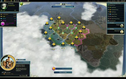
This brings me onto another game play change: city expansion. Whilst culture is still used to expand the city radius, it’s done in a more creeping manner of one tile at a time rather than the circumference expanding at one. Also added is ability to now buy tiles for expansion. This allows you to focus your expansion towards certain resources, and it is now not unusual to see “fingers” emanating from your cities. It also gives territory a more chaotic look rather than the structured feel before.
 The pink tiles shows where the city might expand into when the culture meter fills up. Alternatively you can buy tiles. The further out, the more it costs.
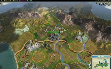
 Here I've expanded to reach the sheep resource. This tile is also a natural choke point between the mountains.
LIFO!
Continued overleaf...


