Interface issues
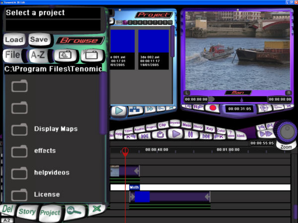
To say that 3D Edit has a unique interface is a rather large understatement. The fact that the GUI is entirely rendered in 3D means that it diverges entirely from Windows standard features. There is no file menu along the top, and no button bar beneath. Instead, everything is operated using proprietary buttons and dialogues. With no context-sensitive help or tool tips, this takes some getting used to.The Browser Tool’s file dialogue is perhaps the most alien. Almost all Windows apps put a handy ‘Look in:’ drop down at the top of the File>Open dialogue, containing common destinations such as My Documents and drive letters. But with 3D Edit, finding files stored outside the default locations is a laborious task of cycling up and down directory tree structures in the Browser Tool. There’s no recent-files list either, and that’s a further pain. The file dialogue is fundamental to using 3D Edit. It’s used not only for opening projects and importing media but for reaching the files that define transitions - and these are also kept as separate files that must be accessed directly. So, unlike every editor we’ve seen, there’s no convenient browser of available effects neatly arranged by category.

The Browser Tool doesn’t follow Windows standard and isn’t terribly user friendly.
That’s a bit of a problem when it’s central to opening projects,
importing media and adding effects!
Although the windowed version can be maximised, we found some strange behaviour working that way. Sub windows would inexplicably return to the size and relative location they would have had if 3D Edit were not maximised. This generally led to these windows half disappearing behind others. In full-screen mode, it also took us a while to realise how to exit the application, since there’s no button (or menu item) to perform this function. Eventually, we realised that simply hitting the Escape key exited the program, which again makes sense if 3D Edit is approached as 3D game title rather than a video editing app, but will be off-putting to almost anyone whose computing time doesn’t revolve around games.
The 3D Edit interface is full of such quirks. The bottom line is that a close read of the HTML-based manual is a necessity for anyone hoping to make any sense of this software. The ten tutorials are highly recommended as well. Once the Tenomichi way of doing things has been grasped, 3D Edit becomes a lot clearer. Apart from the aforementioned file dialogue, most functions only require a button click or two to operate. There are buttons to call up the various windows - such as Project, Shaderman, and Clip panes - and each can be zoomed to fill most of the interface when working with one of them exclusively.


