Jump Lists and Taskbar inconsistencies
Expanding the functionality of the new-look Windows Taskbar is a feature that makes its debut in 7; Jump Lists.
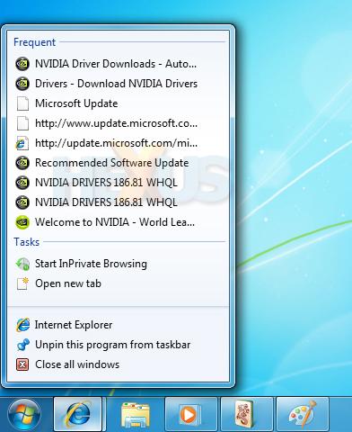
Essentially an expanded set of menu options, the Jump List is available by right-clicking any icon in the Taskbar area, including both shortcuts and open applications.
Designed to provide unique menu options tailored to each application, Jump Lists will provide access to commonly-used functions at the click of a button. In the above example, the Jump List for Internet Explorer provides a number of shortcuts including the ability to open a new browser, open a new tab, or visit one of many frequently accessed websites. Similarly, a Jump list for Windows Media Player would provide access to recently-played media, whilst a jump list for Notepad would list recently opened documents, etc.
Once settled into familiarity, it becomes a powerful tool, and it's usefulness is expanded onto the Start menu, too.
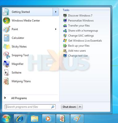
Once again, Start menu Jump Lists provide shortcuts relevant to the highlighted program. The Start menu also retains its built-in search functionality - a tool first introduced with Vista. New to the search box is the inclusion of control panel items in search results. For comparison's sake, we've had to use Windows XP for long spells during this review, and we're starting to wonder how people live without the Start menu's search functionality. We'd put it up there alongside bread and milk as everyday essentials.
Despite the promising introduction of new functionality, Microsoft's bold revision of the Taskbar isn't without its faults. During use, we've noticed a handful of shortcomings. Firstly, it isn't possible to pin multiple associated items separately onto the Taskbar. For example, if you try to pin your Documents, Music and Pictures folders, all three will automatically be added to the Jump List for the default Explorer shortcut, as opposed to independent shortcuts for each. Similarly, you can't pin shortcuts to multimedia files, they'll automatically be added to the Jump List for Windows Media Player.
Secondly, multiple instances of an open application or window are automatically grouped together on the Taskbar, irrespective of whether the Taskbar is viewed with or without labels. As a result, it isn't possible to rearrange, say, two instances of Internet Explorer. Both move in unison for no apparent reason, and despite our best efforts, it's impossible to separate them.
Rounding off the oddities, there's a lack of consistency between the Taskbar and the notification area. Whilst right-clicking on a Taskbar entry brings up a well-designed Jump List, right clicking on an item in the notification area just presents an ugly list of text links. Speaking of inconsistencies, 7, like its predecessors, is prone to the occasional slip-up, and despite Microsoft's desire to polish every conceivable area, there are bits that have been overlooked.
Take, for example, the tooltips for minimise, maximise and close. For some unknown reason, they appear in the old Windows XP style, with a cream-coloured background and a square box (pictured above, right). They should, by all accounts, be uniform with the updated tooltip design, featuring a whiter background and rounded edges (pictured above, left).
But let's not be too harsh. Our complaints are minor, and in the grand scheme of things, 7's implementation of the Taskbar is the best we've seen. It's highly customisable and it's further empowered by a revamped Windows Aero.


