Introduction
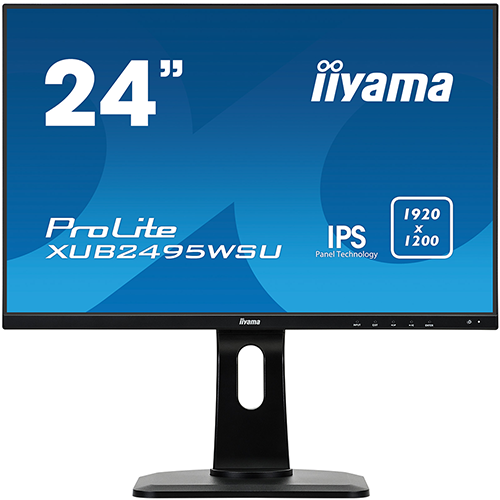
16:9 monitors might have managed to dominate the market, but they aren't for everyone. Creators, in particular, prefer a taller panel, and if you look hard enough, there are still some 16:10 solutions being brought to market. We've recently examined the AOC X24P1, and today we turn our attention to iiyama's ProLite XUB2495WSU-B1.
Priced at £230, this 24.1in addition to the iiyama product line touts a 1,920x1,200 WUXGA resolution and is designed to offer "excellent performance for graphics applications and CAD, and ideal for universities, corporate and financial markets." Expect build quality to be a tad more robust than typical consumer panels, and note that while the monitor is backed by a three-year warranty as standard, this can be extended to five years for public sector, education or corporate use.
iiyama is clearly aiming for the workplace, but there are plenty of reasons for home users to consider the ProLite XUB2495WSU-B1 as a highly competent all-rounder.
Design
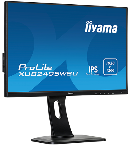
From an aesthetic perspective, the new ProLite ticks almost all the right boxes. The top and side bezels are slim enough to be barely noticeable, the matte black paintwork is inoffensive, and the stand's base doesn't occupy too much desktop real estate. It's worth noting, however, that the monitor arm needs to be attached to the base using three screws. That's two more than most, and while it's hardly cause for complaint, it could be a minor frustration if you're kitting out an office with, say, 30 new screens.
The overall appearance is both neat and modern, although we aren't overly keen on the text labels for the touch-sensitive buttons lining the bottom-right edge. The white font catches the eye and detracts from the otherwise sleek aesthetic, and while the on-screen menus are tidy enough, the touch controls feel somewhat fiddly. We'd much prefer tactile buttons.
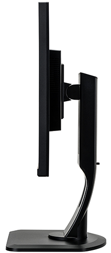
Dimensions reach 532mm (W) x 527mm (H) x 230mm (D) with the panel at its highest point, and given the target audience, all the requisite adjustment options are present and accounted for. These include -5°/+22° of tilt, 90º swivel, 130mm height adjustment, and the ability to pivot into portrait mode. Having the option to switch to portrait is quite common on today's displays, yet it proves all the more worthwhile on a 16:10 panel such as this; 1,200 horizontal pixels are a fine fit for web browsing.
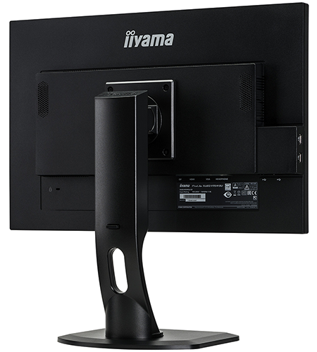
There is, of course, a 100mm VESA mount for alternative placement methods, and along with the integrated power supply, iiyama includes a basic set of stereo speakers to minimise desktop clutter. As is often the case with onboard audio, the speakers aren't the best but they'll suffice for general office work and the occasional YouTube clip.
Specification
What sets the XUB2495WSU-B1 apart from regular 1080p monitors is the panel, and specifically the 1,920x1,200 resolution. An additional 120 vertical pixels doesn't sound like a major advantage, yet in practise it can make a world of difference. Anyone who has used a 16:10 screen is likely to agree, and iiyama's implementation is solid in most departments.
The 24.1in IPS panel offers excellent viewing angles in all directions, brightness of up to 300cd/m² and a standard 60Hz refresh rate. A 5ms response time reveals that the monitor isn't intended for gamers (though you do have a choice of overdrive settings if you insist), and if you're serious about content creation, do be aware that colour coverage is quoted at 99 per cent sRGB but only 72 per cent NTSC.
iiyama's panel is in line with expectations, however there's room for improvement in the I/O department. The inclusion of DisplayPort, HDMI, VGA and a headphone jack is par for the course for an office display, but in late 2018 it's a shame the USB hub is limited to 2.0 speeds. Four Type-A ports are available - two on the underside, two lining the left edge - and we'd expect at least the latter duo to offer support for the newer 3.0 standard.
We'd love to see more adventurous 16:10 panels - a 27 incher with a 2,560x1,600 resolution and 120Hz FreeSync would be right up our street, or better yet a standalone Surface Studio 2 display - but taller monitors are ultimately few and far between. Still, a WUXGA resolution remains a fine fit for the workplace, so let's run the benchmarks before reaching a verdict.


