Benchmark Notes
It's been a long time coming at HEXUS, but we're slowly moving over to a new set of tests, both for graphics cards and for system based articles.A new set of tests means new graphs, so I've decided to roll out a new style of graph today to gauge reactions over the old style. The old style was 4 graphs per page, 3 for the test resolutions and settings we test at and a single graph that showed performance drops.
It occurred to me that all the information on all 4 graphs could be shown on a single graph. That means a lot less work for us creating them and a lot less for you to digest in terms of file size and overall information. Our image box will take less of a beating too.
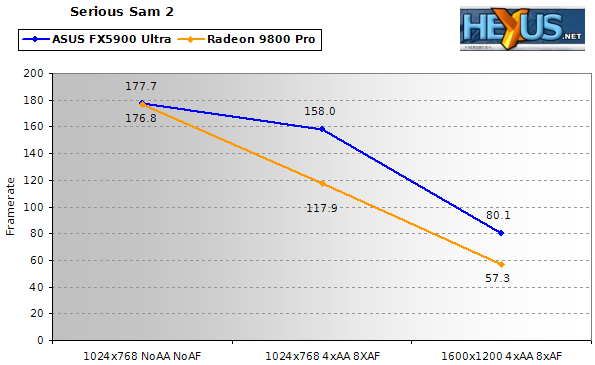
Combining 4 graphs worth of information on a single graph means we'll be interpreting the data a little differently. So here's a sample of the new graph and I'll walk you through how to read it, pointing out where it corresponds to the old format.

As you can see, the 3 points for each card correspond to the first 3 graphs of the old format. We're using point graphs instead of bar graphs, making it possible to plot all 3 of the old graphs at once.
So where's the performance drop graph? It's there if you look closely. Performance drop was simply a percentage of one result compared to another. So if 1024x768 performance with no IQ was 177.7, and performance with IQ at the same resolution was 158.0, that means that the performance drop was 11.08%. We worked that out like so:
100 - ((new_result / old_result) * 100)
With a percentage difference, plotted on a point graph like the one above, it shows up as a line gradient between the new_result and old_result points. See? The gradient of the connecting line between the points is analogous to the old performance drop figure.So how do you interpret that, given that comparing two percentages is easy? Simply, the steeper the line, the bigger the performance drop between the pair of results. In a graphics card review like today, the shallowest line is better. That's the blue ASUS FX9500 Ultra line initially, between the first 2 points, and the orange Radeon 9800 Pro line between points 2 and 3.
You want as horizontal a line as possible, to indicate the best possible performance. Just look at it like a ski slope, you don't want to be skiing down a vertical face do you?
Hard to understand? Just drop by the forums to discuss it with us.


