Introduction
Was the launch of the H440 a couple of years ago a watershed moment for NZXT? Prior to that moment, the US manufacturer of PC chassis and accessories was developing a reputation for undercutting the competition with cheap-and-cheerful solutions aimed squarely at budget builds.
The H440 helped changed that perception. Setting a trend for others to follow, NZXT's mid-tower was one of the first high-profile enclosures to bid farewell to optical drive bays, and the resulting clean aesthetic made it a favoured choice among end users and system integrators alike. Such was the chassis' success that NZXT has developed a follow-up dubbed, quite simply, the H440 New Edition.
Priced to match the original at £90, the New Edition, or NE, claims to have incorporated feedback from the community and features a few tweaks that carry "a renewed emphasis on cooling performance and function."
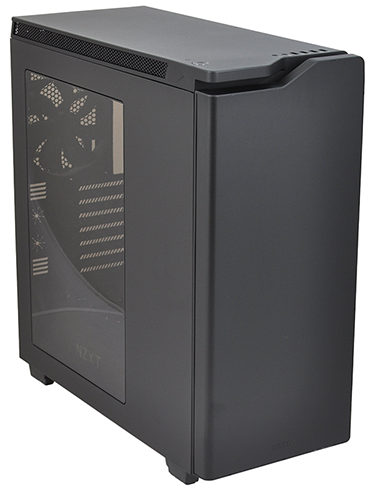
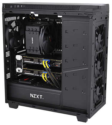
We'll get to those shortly but first let's talk about the streamlined aesthetic. We're of the opinion that the NE is without a doubt the best-looking H440 to date. The matte-black exterior, which we're told is aided via scratch-resistant paintwork, is sumptuously sleek and far more appealing than the A-Team-inspired original.
Various colour options are still available for those inclined (choices include red/black, blue/black or white), with price remaining identical across the range, but it's the all-black model that stands out from the crowd. NZXT has tinted the window for added effect, and the whole case has a classy, smooth feel.
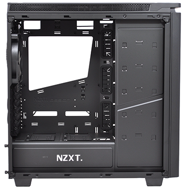
Stating the obvious, anyone who liked the original is going to feel right at home here. At first glance, the H440 interior doesn't appear to have altered a great deal. The PSU bay is still hidden neatly in a bottom compartment outfitted with a backlit NZXT logo, the front third is dedicated entirely to a column of drive trays, and four fans are still included as standard - three 120mm front intakes and a 140mm rear exhaust.
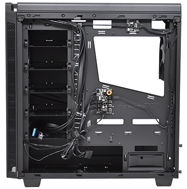
Truth be told, we had to read the paperwork to identify the changes, but they are quite useful when you discover what they are. Firstly, each steel drive tray has been redesigned to allow for disks to be mounted on both sides simultaneously, allowing for either a 3.5in and 2.5in drive on each tray, or two 3.5in drives. This takes the total number of supported disks up to 11 x 3.5in or 8 x 2.5in.
Next is the fan hub, which having been close to useless in the original has been given a PWM makeover, allowing for speed control of up to eight attached fans via a single motherboard header. It's a simple enough tweak, and it's hardly a long-term fix for users seeking precise customisation of each individual fan, yet the PWM hub is arguably the one fundamental advantage to the NE revision.
Last but not least, the H440 NE is technically a fraction larger than the original. Measuring 512mm (H) x 480mm (D) x 220mm (W) in size, the 2015 upgrade is 2mm taller and 5mm deeper. A barely perceptible growth, however NZXT reckons it's enough to aid ventilation and airflow.
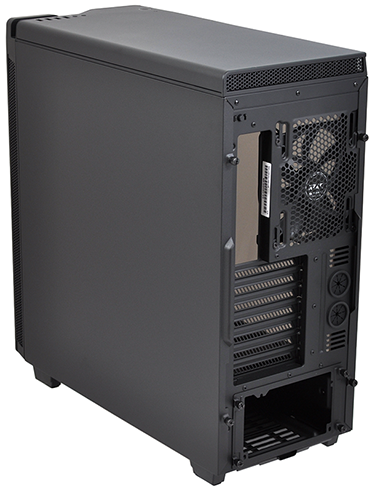
The changes are evolutionary rather than revolutionary, but that's no bad thing, as the H440 was already a solid choice. Build quality is good throughout, it does a great job of making high-end rigs look tidy, and there are some nice touches that end users will appreciate. We like the fact that the rear I/O can be illuminated at the press of a button, and pressing the same button twice will turn the backlit NZXT logo on the PSU bay on/off.
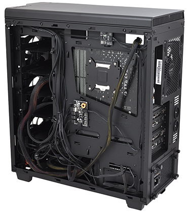
Cable management is good, with plenty of space alongside the PSU to store excess cables, and the side, front and top panels are all lined with good-quality sound-dampening material. What else would we change if there was to be a H440 ENE (Even Newer Edition)? Well, we'd like to have quick-release side panels, and we wouldn't be adverse to the chassis being a bit smaller.
We're of the opinion that the storage column is excessive - who has 11 hard disks these days? - and having ejected optical bays, the H440 should in our estimation have a smaller footprint. Alternatively, for the enthusiast crowd it would make sense for the storage column to be completely removable - taking it out and putting in a larger side window would open up a lot of space for showing off any liquid-cooling paraphernalia.


