facebook rss twitter

Video shows Windows 9 Start Menu in action

by Mark Tyson on 12 September 2014, 09:00

Tags: Windows 8

Quick Link: HEXUS.net/qaci4b

Add to My Vault: x

Some screenshots of what is claimed to be the next version of Windows appeared yesterday. German site WinFuture revealed 20 shots of the latest Windows in action. These screenshots came from an edition of Windows labelled 'Windows Technical Preview'. Now the same site has published a video showing us how the new desktop and Start Menu works and how you can choose between Start Menu and Start Screen based UIs.

The WinFuture video is just over 2 minutes 40s long but neatly shows us many features of the next version of Windows that will be the key to how we use it from day to day.

New Start Menu

The video starts with the new Start Menu with integrated Modern UI attachment, we get to see the user manipulate the traditional looking left hand section of the Start Menu. It looks a lot like you would expect and have seen in Microsoft's official single screenshot from BUILD. The traditional looking area of the menu can hold programs and recent documents and be customised. At the top of this part of the menu Microsoft has put the gadgets for your User Account and Power (sleep, shut down, restart - shown below).
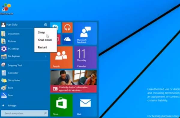
Moving to the right of the menu you get into Modern UI territory. Here you add, move and manipulate tiles just as you would on the Windows 8 Start Screen. If you keep going this menu just keeps expanding so can get pretty big with a few large sized live tiles on there.
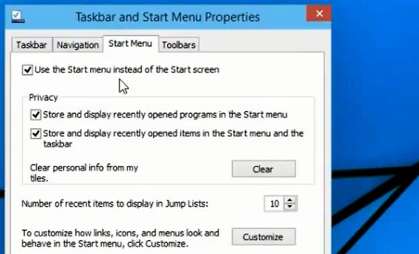
'Use the Start Menu instead of the Start Screen' option

Next we see something very important. In the taskbar properties the WinFuture team shows us the 'Use the Start Menu instead of the Start Screen' option. This is good to see as we had heard that somehow this choice might be decided for you, by a systems maker for example, and it wouldn't be such a trivial task to switch.
Other new features

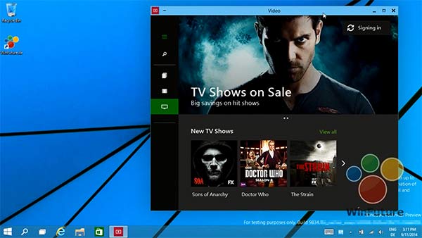
Finally we get to see another feature we have heard about a few times; Modern UI apps in desktop Windows. This feature simply works, with resizable windows and no screen snapping is required.

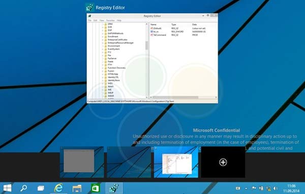
Please note that the Windows Search function has been moved to an icon in the taskbar sitting proudly next to the Start Button,see picture above. Something I didn't notice in the video but is present in the screenshots is what appears to be virtual desktop switching, see below.
Microsoft is expected to release a preview version of the next version of Windows near the end of this month or early in October. Features that you see in this video might have been tweaked and changed by that time, we shall have to wait and see.

What are HEXUS readers' impressions of the new Windows UI and Start options?


HEXUS Forums :: 28 Comments

Login with Forum Account

Don't have an account? Register today!
Looks like a step in the right direction, even if it is basically a rip off of classic shell ;)
Gotta say though, wish they would ditch the flat look of the OS. I have a beefy PC for a reason, give me shiny graphics !
Why is power off still in a sub-menu, and come to think of it, why isn't it at the bottom as it is on both sides of the screen with Windows 8.1?
On the whole looks very promising - particularly looking forward to the windowed MUI apps option.

One thing that really bugged me though, and it's a hangover from the current MUI Start Screen, is the fact that you can't organise the MUI section of the Start Menu however you want. The video clearly shows that you can't, for example, have a single column of small tiles - when the user tries to drag one small tile under another it insists on snapping the tile next to the existing one. Why the hell would it do that? Why can't I arrange the tiles however the hell I want?? WHY?? :censored:
Long way to go yet - have a look on Winbeta.org, and you'll see how quickly things are changing. We still don't really know if we'll be forced down one road or the other, or if we'll get a choice as we really want.

Personally I still want to get rid of the pointless start menu button that wastes 3/4“ of my taskbar (just like in 8.0) and could live with this new hybrid start menu idea (especially if you can make it just modern UI in the popup bit) - that would work rather well. even more so if you could customise it's location so that it acts as a floating menu you can show/hide with the windows key on your keyboard (or button on your tablet).

We'll see though, a while to go yet :) worth noting that the TP build has been leaked (as well as the screens) but reportedly it's not worth installing yet. Think ”longhorn Alpha" stage and you'll be about right.
On the whole looks very promising - particularly looking forward to the windowed MUI apps option.

One thing that really bugged me though, and it's a hangover from the current MUI Start Screen, is the fact that you can't organise the MUI section of the Start Menu however you want. The video clearly shows that you can't, for example, have a single column of small tiles - when the user tries to drag one small tile under another it insists on snapping the tile next to the existing one. Why the hell would it do that? Why can't I arrange the tiles however the hell I want?? WHY?? :censored: