Beauty of the web
We brought you the low-down from Microsoft's London IE9 launch-event last night, but now that the dust has settled we've had a chance to play around with the new browser. Is it worthy of the company's hype, and does it right the wrongs of past iterations? Let's have a quick look.
Rock the house
After months of waiting, whispering and rumours, the latest version of Internet Explorer has finally been released into the wild. Launched with much fanfare in London and San Francisco, the browser hopes to continue the company's success with Windows 7 and recover some of the browser's shrinking market-share.
Gorillaz helped to kick off the party in the UK, with the software-giant showing off the bands new website, written in HTML5 and running on IE9 in all its hardware-accelerated glory.
Baby with the bathwater
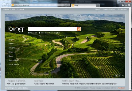
But there's a lot more here than just support for new standards. Microsoft has tossed out almost everything and started from scratch. The interface, for starters, has a sleek, clean new look that really clears away the clutter and just leaves the essential controls out on display. The search and address boxes have been integrated into the new ‘One Box' and all unnecessary options - and even favourites - have been hidden behind discrete buttons by default. The difference between IE8 and IE9 is like night and day, and even Firefox 4 looks a little dishevelled next to the elegance of Microsoft's browser.
The redesign also extends to the notification bar, which now appears discretely at the bottom of the screen, rather than at the top or obtrusively popping up in the centre.
A lot has changed under the hood too. As well as HTML5 support and GPU-acceleration, there's an all new JavaScript engine, codenamed Chakra. This should finally let Internet Explorer run with the competition, rather than lag behind like IE8, though we haven't had the chance to run thorough tests yet. Security has also been bolstered with a new download manager, better reliability and improved InPrivate features.


