Software
We won't delve too deeply into Microsoft's latest Windows operating system - that ground's been covered in our multi-part review - but there are key differences between Windows 8 on the desktop and Windows RT on a tablet that need attention.
The most striking change in behaviour is that tablet users are likely to spend almost all of their time in the Modern UI, as opposed to PC-based power users, who will continue to reside on the desktop. Sounds obvious enough, but it reaffirms the common opinion that Windows 8 is two experiences shoehorned into one.
But the plot thickens with Windows RT, which, as you might recall, can't run traditional x86 programs. Try to install a legacy app - say, the Google Chrome web browser - and a blunt message pops up on screen; This app can't run on your PC.
We're not surprised, this is what we expected from a Windows RT tablet. But what did strike us as odd is that Microsoft opted to include the desktop at all. On a traditional PC, the Modern UI becomes an afterthought - you only really go to it when you need something specific. On a tablet, it's the complete opposite - you rarely feel the need to drop into the desktop.
And, when you do feel that need, it's probably going to be for a task that Microsoft could have made available in the Modern UI. Instead of this disjointed dual environment, Windows RT could have have offered a more consistent user experience by excluding the desktop all together, and that's a change we expect to see in Windows 9.
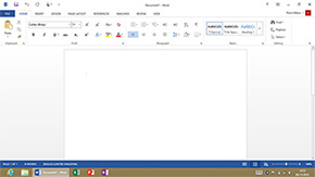
As it stands, the inability to install any of the x86 programs you use on Windows 7 limits the usefulness of the Windows RT desktop to a handful of pre-installed Office programs that Microsoft has re-tooled to run on the ARM instruction set. These include Word, Excel, PowerPoint and OneNote, as well as some Windows basics such as Explorer, Paint, Notepad and Calculator, but that's about it. Even Windows Media Player hasn't been brought over, so if you want to play any music or video, you'll do so using apps from the Windows Store.
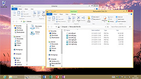
We'll admit, the ability to create documents in Office programs is a real value-add, and Windows Explorer has its benefits too. It's surprising how satisfying it is to be able to plug in a USB pen drive and copy files to and fro a tablet, or even an external input device - we tried a few keyboard and mice, and Windows RT worked with all of them. Better yet, the underlying Windows foundation also allows for multiple user accounts, making Surface a good choice for the entire family.
These features help Surface stand out, but the desktop interface isn't ideal for a touchscreen - we found ourselves repeatedly missing some of the smaller icons - and we can only imagine how satisfying the experience would have been if Microsoft had taken the time to port these few programs to the Modern UI.
Part of the reason for wanting to see everything baked into the Modern UI is that it's an excellent interface for a touchscreen device. While Windows 8 works reasonably well with a keyboard and mouse, it comes alive on a tablet. It helps that we've been running Windows 8 since the early days of the Consumer Preview - we already know where to find the Charms, Live Tiles and App Snaps, but using them with the tips of your fingers feels very natural.
Surface responds well to gestures, it feels nippy to get around, and the ability to switch between, close or snap various apps with a single swipe makes multi-tasking that little bit easier. The interface is attractive, with Live Tiles giving Microsoft an exclusive look, but playing catch-up has obvious consequences; you come to expect things the iPad way. Live Tiles can't be resized by using the hold-down-to-adjust shortcut available on the iPad and Windows Phone, instead you have to use a hold-and-drag motion that doesn't necessarily feel bad, it's just different. And, on an iPad, you're accustomed to having battery, time and Wi-Fi information readily available - on Surface, these details are typically hidden behind menus.
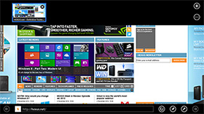
There is a learning curve involved, particularly if you're coming from a different tablet ecosystem, but while it takes a few days to get accustomed to Windows 8 on a desktop, you can become fluent with a Windows RT tablet in a matter of hours. It helps that Microsoft has a pre-installed selection of apps to cover most bases. The mail and calendar apps are competent if not spectacular, Internet Explorer 10 is fast and fluid (though Flash support is limited to a list of Microsoft-approved websites), and the three Xbox apps - Music, Movies and Games - offer plenty of entertainment.
Microsoft has covered most of the basics, but you can tell that Surface is a first-generation product. Some of the apps feel utilitarian at best, updates are served through Windows Update and the Windows Store, as opposed to one central location, and there's no unified notification centre. We also came across one particular quirk; our Surface has developed a habit of muting at seemingly-random intervals. We're struggling to figure out why it's happening, or whether or not it's a widespread issue, but this much is certain; Microsoft needs to roll out regular updates to improve the core apps and iron out any other creases.
What's more of a long-term question mark is the Windows Store, which of course has less content than the Apple and Google alternatives. App availability is improving on a daily basis - Angry Birds, Netflix and Skype have all shown up since the October 26 launch - but Microsoft still has some way to go, and seeing as legacy programs aren't an option on Windows RT, it needs the Windows Store to fill up quickly with high-quality content.


