Speaker Design and Layout
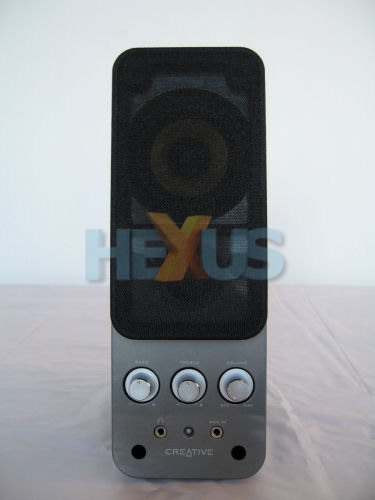
Creative has always had a knack of producing well-built products, and the T20 speakers are no exception; the build quality, subjectively speaking, is excellent. The main body of the speakers is made from a simple black plastic shell, fitted to which is a smooth, gun-metal-coloured, high-quality plastic front panel.Working up from the bottom, the front of the T20's features a simple screen-printed Creative logo flanked on both sides by screw holes where the front panels are secured to the main speaker body. Above this we have a headphone port on the left, and an Aux in for your MP3 player, etc., on the right.
Now there is one thing worth mentioning here - in between these two ports is a single blue LED.
This is used to indicate when the speakers are powered up. The problem here is that it's in-your-face and seriously very bright. On previous speakers we have looked at from Creative this hasn't been such a problem as they have all used wired remotes. Now with this feature missing from the T20s it means you have to angle the speakers exactly how you need them, therefore causing your eyes to be distracted by the bright light of the LED all too easily.
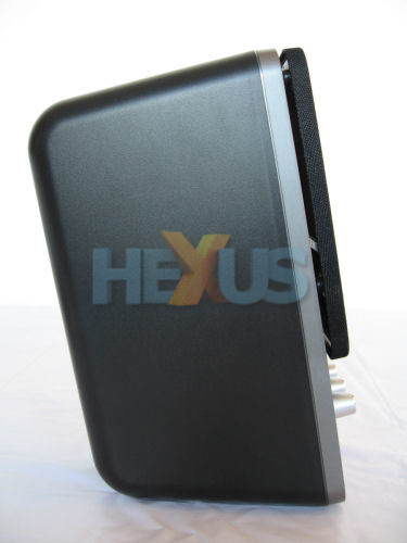
Turning the speakers around to the side, you can see the angled stance of the T20 means that they really need to be placed below the head height of the user. The good news here is the compact profile of the speakers does mean that very little shelf or desk space is required, though.


