Interface
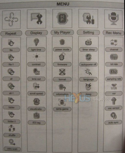
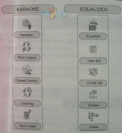
The player has quite a complex menu structure but it’s reasonably intuitive and gets easier once you’ve used it for a while. Images below are lifted from the manual.
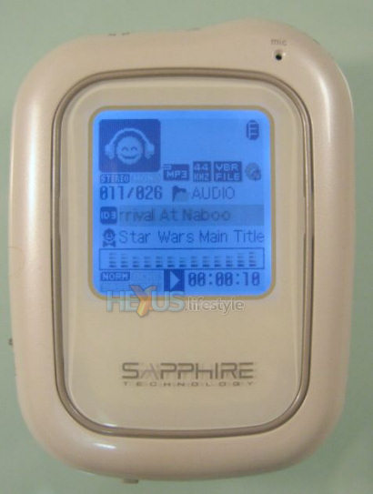
The playback screen - shown below - lets you choose what type of visualisation you want and whether to read the ID3 tag - though, because of its greyish background, that's especially hard to see when the backlight is not on.
[advert]
Menu transitions are fast and there’s no waiting around to get to the option you select - a great thing if, like me, you can’t stand slow menu transitions. The only minor niggle I had with the menu structure was that each of the three menus are accessed via a separate button.
Due to its small size, reaching all of the buttons is either fiddly or requires a second hand. Other players have managed comfortable single-handed operation - something Sapphire might have been able to achieve if it had consolidated those menu buttons.


