Mac OS X overview
Apple's OS X operating system is based on a Unix kernel and, as any system administrator is likely tell you, most well-written Unix-based OSs are more rugged than Microsoft's best attempts at an operating system - and able to be set up more securely, too.
In day-to-day terms, this doesn't necessarily mean OS X never crashes - though the operating system certainly didn't crash during our time with the mini - but that system crashes are, perhaps a little less likely than with XP and certainly far less likely than they were with earlier Mac operating systems.
That change, we know from first-hand experience of working in editorial offices where Macs dominate, was a blessing to Mac power users and a feature that helped bring Apple's operating system into the 21st Century.
On the security side, one of the slightly irritating things we noticed is the need to input your user password whenever a significant changes to the system was about to be made - and for some inconsequential changes, too. That might be a good thing in a workplace or when kids have access to your Mac, but it's a bit of a chore for lone home users, though there is probably a way to turn this off that we didn't have time or the inclination to discover.
Significantly, and like Win XP - and Win 2000 and Win NT before it - OS X is a multi-tasking OS that is comfortable running and switching between multiple applications. That's why lashing of RAM is a good thing, just as it is with XP.
Multi-tasking was another massive step forward from the poorly way in which OS 9 handled the running of multiple apps, where if, for instance, you were printing a complex document, you could do nothing else with the Mac in the meantime. And, like XP, OS X is well placed to make good use of dual-core CPUs such as the one in the mini that we tested - though both operating system are reliant on the writers of software making their programs take best advantage.
Despite being Unix-based and despite the assertion we made in the introduction, OS X probably has, from the user's viewpoint, more things in common with Windows XP than difference.
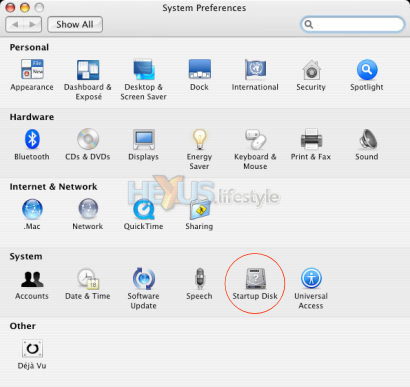
It's got a graphical user interface over which the mouse rules and where the right-mouse-button has a considerable role to play. Many of the visual metaphors employed by OS X will be immediately understandable to Windows users, as will many of the tools, such as OS X's Control Panel equivalent - System Preferences - shown below.
But there are many superficial differences and the first few that a Windows user is likely notice at the outset are that:
* There is a menu
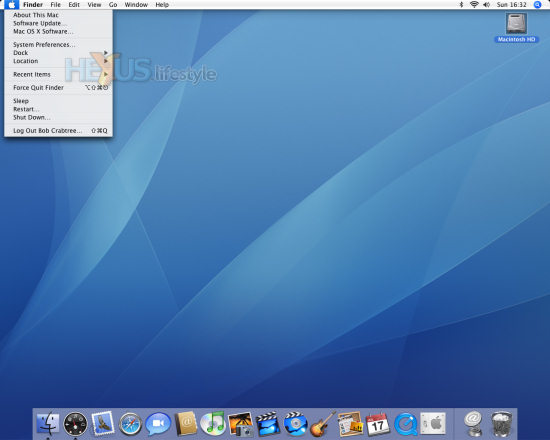
bar along the top of Mac OS X's desktop plus an icon
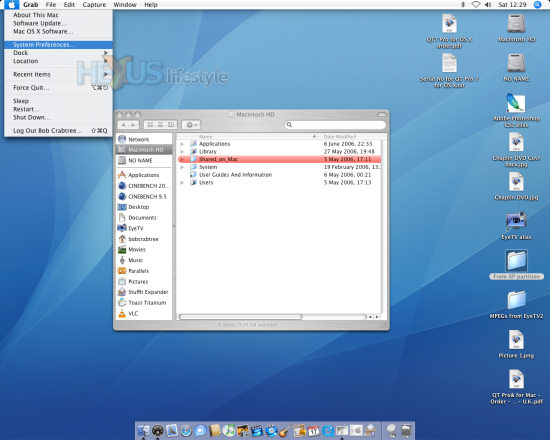
ribbon at the bottom in the centre that can be resized (compare it on
the two screengrabs below). The ribbon itself and the icons on it can
give animation effects - the ribbon curving up in the place where the
mouse hovers and program icons bouncing up and down to show that the
apps are loading - though both effects can be turned off
* OS X's main controller menu - the Apple menu - drops down from the Apple button at the left of the menu bar, rather than rising up from bottom left as when clicking on Windows' Start button in the Taskbar
* The system clock and other information displays appear at the right of the screen-topping menu bar, rather than, like Windows, in the System Tray at the bottom at the right of the Taskbar
* The Trash - Apple's deleted-files-container icon (something that massively pre-dates Windows's Recycle Bin) isn't located on the desktop like the Recycle Bin and as it was in earlier Mac operating systems. Instead, it's fixed in place on the far right of the icon ribbon at the bottom of the screen and, thus, visible at most times. However, the user can set up OS X so that the icon ribbon auto hides. Also, folder and program windows aren't prevented from fouling the icon ribbon

Among other things that are noticeably different, as you'll see in the screengrab below, are:
* Icons added to the desktop arrange themselves in columns that start at the top right, rather than top left
* Program and folder windows generally open in the top left three-quarters or two-thirds of the desktop (okay, that's rather further up and to the left than the screengrab shows), so as to leave visible the first few columns of icons at the right of the desktop
* Although program and folder windows do have close, minimise and maximise buttons (at top left, rather than top right), maddeningly and for no reason we know of, users can only manually resize windows by clicking and dragging the bottom right-hand corner in, out, up and down. There is no option to resize from any other corner or on any of the edges. What we're about to say might sound massively over the top, but we believe that perhaps the most important change that Apple could make to get experienced Windows users feeling comfortable in OS X is to get it to mimic the far more flexible resizing options offered by XP and older versions of Windows.

What you'll also notice in the shot above is the array of icons that are found in the two-tiered pane to the left of every open folder. In the top pane, these encompass links to the network, to all open network places and to all drives on the system that are active, including virtual drives of the sort that often appear on the desktop when you run downloadable program installers or software updaters.
A DVD and CD drive or burner only shows in that top pane when it contains a disc. At that point, it will also show on the desktop, or, rather, the disc does. That's also true for the pane as well - what you see there is the disc not the drive.
In the lower pane is a link to the Applications folder - the place where, by default (but not necessity), programs and utilities are stored - plus icons that the user has dragged there to gain quick access to frequently-used programs.
It would be possible to write a book telling Windows users all about OS X but we don't have the space here to explain a great deal more - and, anyway, lots of more knowledgeable Mac writers than us have done that already. So, we'll round off this brief overview of Apple's operating system by detailing what we think are some of its high points.
For a Windows XP old-hand used to laborious program-installer routines, one of the apparent miracles of OS X is the way that you typically install a program from CD or DVD simply by dragging and dropping a folder or icon from the optical disc into OS X's Applications folder.
Even more miraculous (though rather nerve-racking for this Windows die-hard), uninstalling almost any program typically involves nothing more than dragging its folder (or icon, if it doesn't have a folder) from the hard disk into the Trash. Once it's in the Trash it no longer functions and once you empty the Trash, it's gone.
But for seriously nerve-wracking (and counter-intuitive, at least to a Windows user), consider this. If you've attached a removable hard drive and want to disconnect it without shutting down, then how you do that is to drag the icon off of the desktop and into the Trash - something that will cause your bowels to go slack the first time you do it (and, in our case, every time thereafter).
We know that under XP, if there were a desktop shortcut to a drive, all you'd do by dragging it into the Recycle Bin is move it there and that emptying the bin would only delete the shortcut. We also know that if you open up a My Computer Window and try to drag a drive over into the Recycle Bin, Windows will politely refuse - putting up a no-entry sign.
But none of that makes it any more comfortable to be dragging drives over into OS X's Trash. Fortunately, though, there is a remove option on the drive's context-sensitive pop up menu, and, if you have your mouse set up so that the right button works as it does in XP, that menu is instantly available - as are other such menus elsewhere in the OS and in some programs.
As an aside, quite a few programs shown in the Applications folder may appear to consist of nothing more than a single icon but, if you click on one and bring up the context-sensitive menu, you'll usually be given the opportunity to browse inside. Yes, the icon is both a link that you double-click on to run a program, as well as a folder that contains the program and its associated bits and pieces but can't be accidentally opened for exploring by double-clicking.
From our experience with this and earlier versions of OS X, users will have a lot less messing about installing drivers for new hardware than with XP. We've yet to figure out why this is - hopefully, we'll get wised up in the HEXUS.community by long-time users of OS X - but it is a fact.
Yes, XP does now have a massive drivers database and is much easier than earlier version of Windows when it comes to driver installs. But, with OS X, it's even more likely that you'll be able to plug something in and just see it start to work. A classic example was the way that we were able to use two different USB TV tuners under OS X quite transparently.
Both, we knew, could be controlled from the same program - Elgato's eyetv 2 - but, even so, we were highly surprised when, just out of curiosity, we removed the first and connected up the second and saw it start working as soon as we fired up eyetv 2.
Perhaps OS X has some all-encompassing built-in driver for TV tuners, or maybe Elgato's software provides an especially clever driver as part of the package. We simply don't know. But the way we were able to swap tuners around left us beaming like a kid that had found a big bag of favourite sweets.
About the only faffing about with drivers we suffered was when we wanted to print from OS X to a Canon four-in-one (a Pixma MP780) attached to one of the PCs on our Windows network. Even then, the OS did point us (though in a rather convoluted fashion) towards the driver (albeit a beta) that it had ready for us to pick from a list. Print quality, though, it has be said, wasn't stunning.
It's worth commenting here that we found file-sharing with our Windows PCs far easier than we had a few years back with the first few early versions of OS X. And, contrary to a recent Mac mini review we read in one of the few Windows print magazine that we have some respect for, it is possible for this process to be two-way.
As well OS X being able to access folders on Windows PCs that have been set up for file sharing, it is a relatively simple matter to set up a folder on the Mac for each user - Apple calls it a drop-box - that's visible from Windows PCs. Files can be dropped in there and copied out, too.
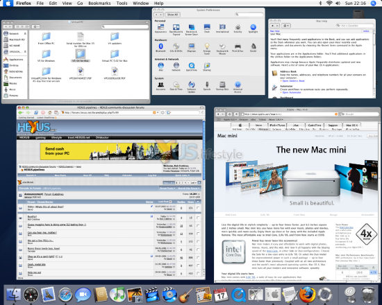
Something that greatly tickled our fancy with OS X - and we guess it came about because of OS X's ongoing daft handling of the resizing of program and folder windows - was Exposé. This is Apple's snappy name for the system within OS X that lets you easily switch between open windows, or between multiple windows within one application.
Pressing the F9 function key shrinks all open windows to sizes small enough to let you see them all at once. Having done that, you can click with the mouse on the one you want to be working with and all windows will revert to their previous sizes, with the new active window in the foreground.
Alternatively, you might just want to check up on something - say a TV programme or the progress of some rendering action - and then return to where you were. If so, just press the F9 key a second time. This alone is a sensational feature - and you can see the effect below of the first press of the F9 key - but there's even more to Exposé.

The F10 key is used for a similar but subtly different purpose - rescaling and bringing to the foreground only the windows that are open by the app you're working with. As you'd expect, a mouse click is used to change to a different file/window. It's a feature that Photoshop users especially will delight in if they tend to work with a large number of images open at one time but is unnecessary for apps that keep their windows within tabs - something that's more common under XP than Mac OS.
The final feature in Exposé is a keyboard equivalent - F11 - to the Show Desktop icon found in Windows' Quick Launch task bar. Being a key press, it's rather more convenient to use than the Windows' icon method - and, anyway, lots of XP users never even see the icon because many system builders don't turn on the Quick Launch bar (something you can fix by right-clicking on Windows' Taskbar and choosing Properties). As with the F9 and F10 Exposé functions, pressing the F11 key brings back all the windows to where they were before.
These three operations can also be set up to be performed using mouse buttons and that's the main reasons why we said earlier that we'd ensure we were using a five-button mouse with OS X, rather than one with only three buttons.
Another reason, of course, is so that you have easy access to context-sensitive menus. The alternative way of bringing up these menus is hold down the Apple key (located where Alt is on a Windows keyboard) and then left clicking on the item (or just Apple-clicking if using an older single-button mouse).
There's a likely use for yet another mouse button, bringing onto screen all available widget - mini apps that go under the collective name of Dashboard. As standard, these include items such as a calendar, a world clock, a six-day weather forecast, a dictionary, a translator, a phonebook, a metric/Imperial converter, an electronic equivalent of Post-it Notes and more besides. As with Exposé, there's a keyboard shortcut, too, F12.
Okay, you've had the five-minute tour of OS X, so let's move on to how well it lets the mini perform as a media centre PC.


