facebook rss twitter

Windows 8.1 Update 1 said to boot to desktop by default

by Mark Tyson on 31 January 2014, 11:14

Tags: Windows 8

Quick Link: HEXUS.net/qacab5

Add to My Vault: x

Prolific Windows leaks information source WZor has another important find to share with those of us interested in what to expect in Windows 8.1 Update 1. The upcoming Windows version will enable booting to the desktop as the default option, says WZor. Also its "sources familiar with Microsoft’s plans" have told The Verge the same key information.
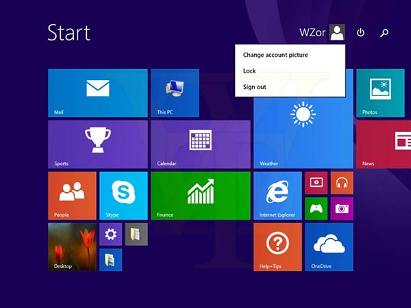
At the start of the week we learned that Windows 8.1 Update 1 will probably be launched on 11th March, thanks to a source speaking to ZDNet's Mary Jo Foley. We also saw screenshots from WZor illustrating important UI tweaks that are inbound which include, to recap, the following things for desktop users:

  • Modern apps can be pinned to the desktop task bar and include mouse-over thumbnails,
  • Close boxes for Modern UI apps will be present,
  • Right-click Modern UI menus for mousy folk will be present,
  • Dedicated search and power icons appear at the top right of the Start Screen next to the user name,
  • But no 'mini' Start Menu…

Booting to desktop by default is a very big move for Microsoft's updated OS - if it does actually get released in this way. WZor says of the latest build of the OS he has played with; "The main thing in this build, and that immediately catches the eye, is that, immediately after installing and loading it, we find ourselves on the desktop (Desktop) PC and not on a tiled interface Modern UI (Metro) as it was previously". As noted by The Verge this change goes against the grain of Microsoft's vision for Windows 8 but appeases many mouse and keyboard jockeys. However, in an update to its story, it reported that "you can't always replicate the boot to desktop changes," and obviously the update is still in testing and more tweaks could occur before its finalised.
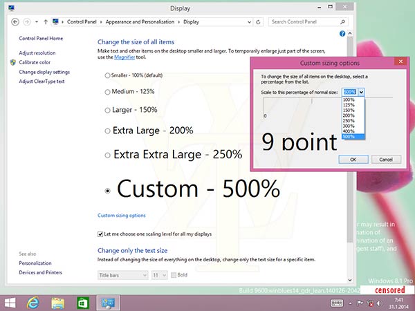
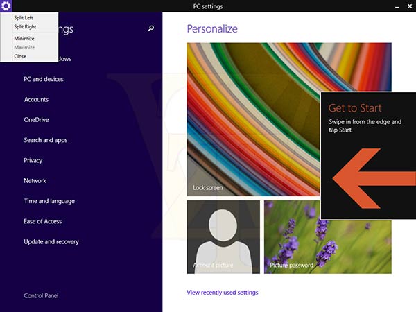
Back to WZor's report and he has some more screenshots showing new tweaks to the Windows Modern UI. Some screen shots show new split screen controls I haven't seen before and also you can see that text and desktop items can be scaled much further than before - up to 500 per cent. This is probably to help users of very high resolution but small screens becoming ever more popular since the 'Retina revolution'. Another highlight of the new crop of screenshots is the showing of the drop down menus on the upper right of the updated Modern UI.


HEXUS Forums :: 21 Comments

Login with Forum Account

Don't have an account? Register today!
You mean a supposed desktop OS is going to (sorta) start putting desktop users first? Maybe if that start menu finally arrives.
“The main thing in this build, and that immediately catches the eye, is that, immediately after installing and loading it, we find ourselves on the desktop (Desktop) PC and not on a tiled interface Modern UI (Metro) as it was previously”. As noted by The Verge this change goes against the grain of Microsoft's vision for Windows 8 but appeases many mouse and keyboard jockeys.
I'm going to ask a very obvious question - wouldn't it have been possible for the Windows 8.x startup to check if there was a touch screen present, and if so switch to MUI as default, otherwise give the user the “mouse/trackpad friendly” standard desktop? Wouldn't that have given the best of both worlds?

Still going to stick with ‘7 for the moment, although a pre-order for ’9 is getting more certain.
Windows 8 is and always was about Touch screen interaction in my opinion. So as I'm not of that genre as yet, i still think windows 8 was rushed out a bit like Vista. but Microsoft never learned their lesson on that OS did they.
I use 8.1 and, honestly, it's not all that bad, but I don't disagree that Microsoft made a terrible mistake with how they approached Windows 8(.1).

A simple choice during setup ("Default boot to desktop, or touch?) would have solved almost everything that ended up being terrible about it.
This is kind of a shame, if true - In principle I like the metro; I prefer tiles to icons (single click, potentially more customisation**, live tiles) - I just wish it had been better optimised for a desktop setting.

All the apps seem to be targeted at tablets - Ebay, Facebook, Hotmail, news streams etc. The tile itself is ok (though more customisation of what is shown would be better), but the “app” behind the tile is all but useless.

** Unfortunately, to create your own tile (for a folder, for example), you need a third party program - MS has really pared back any more advanced features on the Metro, which is annoying, why didn't they include tile creation/customisation by default?

I think the Metro could be great if only they had followed through with it and given it the full functionality of the desktop (plus given the option of a more streamlined Applications menu)