facebook rss twitter

Windows 8.1 Update 1 to arrive on 11th March?

by Mark Tyson on 27 January 2014, 10:30

Tags: Windows 8

Quick Link: HEXUS.net/qab73j

Add to My Vault: x

On Friday ZDNet's Mary Jo Foley wrote that one of her sources informed her that Windows 8.1 Update 1 would arrive on 11th March. Also, at the weekend, prolific Russia-based Windows leakers WZor.net published lots of new screenshots from Microsoft's upcoming update to Windows 8.1. WZor had previously indicated that this update will be RTM at a non-specific date in March.

Windows 8.1 Update 1 arrival

Microsoft's "relatively minor update," to its Windows 8.1 OS will arrive on 11th March according to sources quoted by ZDNet's Mary Jo Foley. She writes that the source is both usually accurate and trustable and that the date in question is a Patch Tuesday – which ties in to the expectation that it will be delivered to users via Windows Update.

Another interesting piece of information from her source is that the update will feature some important behind-the-scenes changes to the OS to reduce its memory and disk space requirements. This is said to be a move by Microsoft to lower the OS burden upon upcoming budget specification Windows 8.1 tablets.
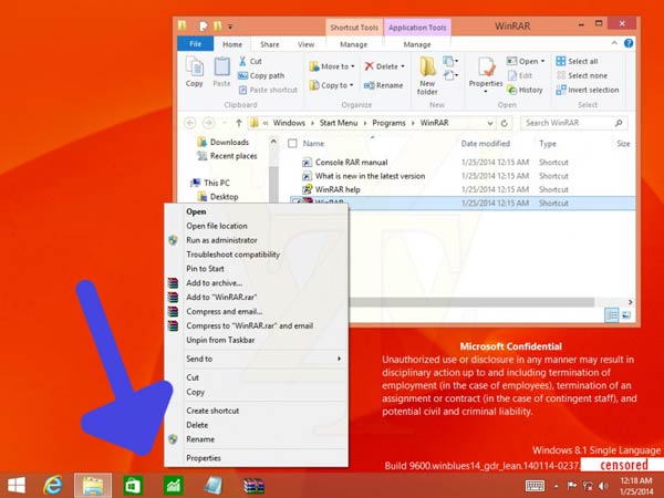
Modern UI app pinned to desktop takbar, rollover shows thumbnail.

WZor screens

Screenshots of the upcoming update to Windows 8.1 show several new and interesting features coming to the user interface on both the Modern and Desktop side of things.

  • Modern apps can be pinned to the desktop task bar and include mouse-over thumbnails,
  • Close boxes for Modern UI apps will be present,
  • Right-click Modern UI menus for mousy folk will be present,
  • Dedicated search and power icons appear at the top right of the Start Screen next to the user name,
  • But no 'mini' Start Menu…

Are any of these additions particularly welcome to HEXUS readers? The power button removal from the right swipe menu would be welcome for me if I didn't just use my PC power button for sleep and wake. However this really does look like a minor update as indicated by Foley.
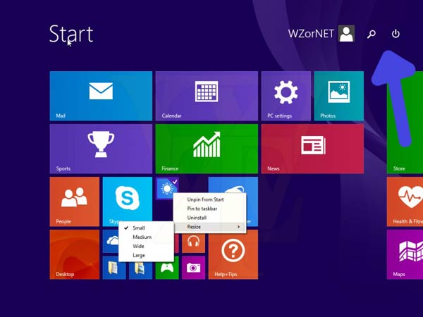
You can see the easy access search and power buttons top right,
also the right-click menu is shown mid-screen

The OS install size and memory requirement reductions are attractive as they should help manufacturers to knock out Win-Tabs even cheaper. I remember writing a year ago about 64GB Surface Pro machines being pretty tight on user storage space while manufacturers of Android and iOS tabs can sell devices with a base storage config starting at 8GB and 16GB respectively and would be able to charge quite a premium for a 64GB device.

Microsoft's Build 2014 conference starts on 2nd April and is expected to follow the release of Windows Phone 8.1 by a matter of days. Bigger changes to both platforms, including work on the unification of the OSes, is expected to come with Threshold about a year later.


HEXUS Forums :: 29 Comments

Login with Forum Account

Don't have an account? Register today!
Power Button on the Metro Start Screen. Good for mouse, pointless for touch. Afterall touch devices and laptops have power buttons, or simply close screen.
Are any of these additions particularly welcome to HEXUS readers?
Probably, but the attitude of this Hexen won't surprise anyone that knows my opinion of Win8.

But for the record, here it is ….

Does it give me my Start button and functionality back? Does it let me turn Metro off completely? Then no, it's not welcome. But it's also pretty irrelevant to me, now. It may well be small improvements for those using Win 8.1 and in that sense it's welcome.

So for me, short of a dramatic about-face by MS, which I don't expect, anything they do with Win8 is neither welcome nor unwelcome, merely irrelevant. And for me, even that about-face would probably be too late.
They are slowly making the desktop more useful. I think it is too late to save the lacklustre sales of Windows 8 but is good for those using it on non-touch screen computers. If these features were present when Windows 8 launched then I would of bought Windows 8. It is sad that Microsoft has to learn the hard way, I don't know how they thought the lack of these options would be beneficial on a desktop computer.

I'm still waiting for them to remove that horrible charms bar and settings, I'd like to be able to change my user account password from control panel rather than using the separated PC settings in the charms bar. It is ridiculous that an Operating System would have two separate area's where settings are collected, especially when one area has been the core of Windows systems for decades and suddenly loses some functionality.
TheAnimus
Power Button on the Metro Start Screen. Good for mouse, pointless for touch. After all touch devices and laptops have power buttons, or simply close screen.
Disagree. First off there's a LOT of non-touch devices out there. Secondly there's a lot of folks (call us “old school” if you want) who don't like to mash the power button to do an OS shutdown and prefer an explicit OS shutdown.

And I don't know about your laptop, but the Windows8 lappie here, if you just close the screen it puts it into hibernate, not shutdown.

The laborious path to shutdown was one of my annoyances about MUI - at least until some kind Hexus'er pointed out the Windows-I shortcut. Windows 9 is looking more and more appealing at this rate… :)
Still very much enjoying my 8.1 experience after setting it to boot/minimize to desktop and installing classic shell to give me back my start menu & keyboard start button.

Basically windows 7 but its snappier ;)