Earlier last week Microsoft published a white-paper discussing in detail its research and plans for the Windows 8 Task Manager.
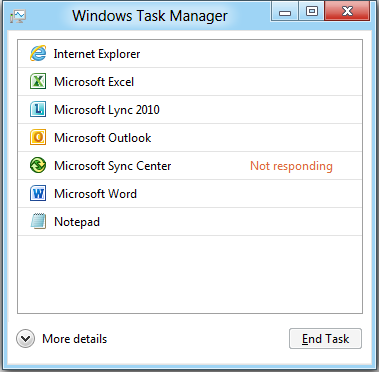
The redesign splits the application into a ‘fewer details’ and ‘more details’ view. Microsoft has chosen to strip all content from the ‘fewer details’ view but for the ability to ‘End Task’, simplifying the task of ending a program and lowering the technical entry point for the typical Windows user, who use their PC as a tool for their job as opposed to the use of Windows being their job.

Fear not, IT professionals and power users, as by providing a safe and simple entry point for Joe blogs, Microsoft has been able to let loose on the ‘more details’ view with a very firm policy in place to remove no features.
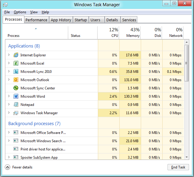
As a power user myself, I can pay homage to some of the changes Microsoft has implemented. The Applications and Processes tabs have been merged, removing the blurry line of what you thought should be in the Applications tab only to find it under Processes instead, what is and isn’t a background process and which process belongs to another.

In the new unified Processes tab, data and even system process and service names have been visually simplified; performance statistics such as network and disk usage have been broken down to individual processes allowing for speedy identification of bandwidth hogs without the need to open a secondary diagnostic tool. This is aided by a new heat map that highlights heavy consumers and makes them stand out. Given the potential for Windows 8 to wind up on tablet devices, this writer believes Microsoft has made a very forward-thinking move when it comes to quickly identifying which programs are eating up bandwidth and running up a 3G Internet bill.
Details still remain to be revealed of changes to other existing tabs and the introduction of several new tabs, such as the curiously named ‘App History’ and ‘Start-up’ tabs but the initial information on the new Task Manager is very promising indeed. Though Microsoft has created a dumbed-down task killer, it has done so without removing the advanced features of the Task Manager and in a way even the ‘more details’ view has been simplified and made more user-friendly and functionally useful than ever before.
This writer has been stepping cautiously around general UI changes to Windows 8 and is holding judgement, but in this instance, a job well done, Microsoft.


