Introduction
There were plenty of sceptics when NZXT ejected 5.25in optical bays from the mid-tower H440 chassis back in 2014, but the timing was right and the H440 has since established itself as a popular choice among end users and system integrators alike.
Appreciating the fact that optical discs are no longer used by everyone, Corsair is responding with a disc-less mid-tower solution of its own dubbed the Carbide Series 400C. Priced at £80 and available in C (Clear) and Q (Quiet) variants, the 400 is far less ambitious than last month's Carbide Series 600, but a £40 saving could make it a more sensible option.
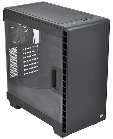
First impressions are favourable. Dimensions of 464mm (H) x 215mm (W) x 425mm (D) make the 400C more compact than your average mid-tower case, and if NZXT's showy exteriors aren't your thing, you'll appreciate Corsair's understated approach. There's nothing but a small Sails logo to interrupt the smooth front cover while a neat row of I/O ports lines the top-front edge and includes only the essentials - a backlit power button, USB 3.0 (x2), audio jacks, a drive activity LED and a small reset button.
It's a smart-looking box and the front fascia is topped with a thin layer of steel, giving the case a more solid feel than its immediate rival. Matte-black paintwork also provides a tidy finish, but the appeal of the 400C is, of course, the quick-release side panel equipped with a near full-size window. Corsair's implementation is good - the release handle feels secure and the side panel lifts easily off its hinges - and for a sub-£80 case, there's plenty of scope to show off your build.
There is, however, a caveat in that Corsair makes you choose between Clear (400C) and Quiet (400Q) models. The former has the lovely side window, but the latter has solid side panels, a solid top cover and sound-deadening materials throughout. It's a choice we don't really want to make, as either option leaves you feeling as though you're missing out. In an ideal world, the Carbide Series 400 would include the side window and noise-absorbing foam on all other panels.
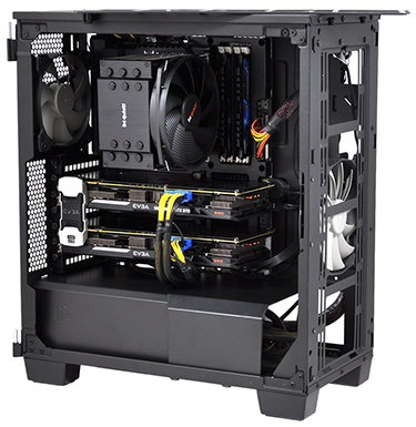
So is it actually worth contemplating ditching your 5.25in drive bays? That will always be a personal choice, but if you aren't intent on using them, Corsair's revised internal layout highlights a few potential advantages. With the traditional storage column taken out of the equation completely, the chassis feels more spacious despite having a smaller footprint than your average mid-tower and there's a clear, unobstructed path for front-to-back airflow.
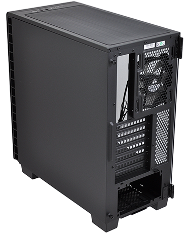
Just the two fans are included as standard (a 140mm front intake and a 120mm rear exhaust), and both are installed on height-adjustable mounts, making it easy to align the fans with your hottest components. Looking beyond the out-the-box configuration, there are half-a-dozen fan mounts in total - including two 120/140s up top, and either three 120s or two 140s up front. For liquid-cooling aficionados that leaves plenty of room to manoeuvre, with a choice of a 240mm radiator in the ceiling or a huge 360mm unit behind the front panel.
Dust filters are plentiful, too. A good-sized magnetic filter covers the top fan mounts, a tall removable filter sits behind the front panel and a pull-out filter lines the bottom of the PSU bay. Of the three, the front filter is the most awkward in that it can't be accessed without removing the front fascia, a process which entails removing both side panels and pressing a series of tricky release clips.
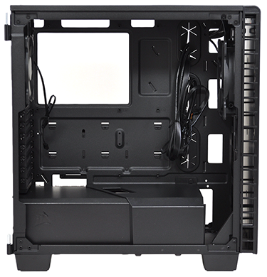
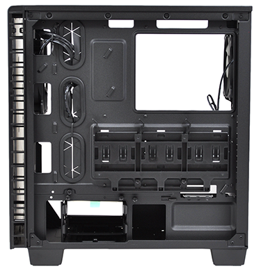
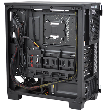
Elsewhere, we get all the usual cutouts in the motherboard tray, a trio of rubber-grommeted cable-routing holes and a pair of removable plastic shrouds that come together to conceal the bottom portion of the chassis. A neat way of hiding the power supply (as well as its associated cable clutter) and Corsair also tucks a two-bay hard-disk cage into this hidden compartment. The drive cage is removable, too, and taking it out gives you a handy space to stow excess cables.
Building into the 400C is fun because it doesn't take long to realise that the end product is going to be very easy on the eye. The cutout in the roof of the bottom compartment is ideal for routing PCIe power cables (it just so happens to be perfectly aligned with the ports on our graphics cards), tie-down points behind the motherboard tray are plentiful, and there's enough space alongside the PSU to keep all the mess hidden from view.
The completed system looks rather good, if we may say so ourselves, yet the build process wasn't entirely free of niggles. When using an ATX motherboard, both the up-and-over and down-and-under routing holes are partly obscured, making it tricky to run certain cables. We'd like the case to be a centimetre or two taller to circumvent this issue, and we wouldn't be adverse to a little more width, either, as space behind the motherboard tray is at a premium. This is in part due to the three tool-free SSD bays that line the tray's back - be aware that the entire assembly can be removed, but individual bays cannot.
Your choice of CPU cooler can stand up to 170mm tall, graphics cards can measure up to 370mm in length, and though the layout isn't as versatile as some of Corsair's larger solutions, it ticks a lot of the right boxes for a certain type of build. The only feature we're genuinely missing is a built-in fan controller, which might have been handy seeing as you can't add a 5.25in solution of your own. And in case you're wondering, the Carbide Series 400Q doesn't have a fan controller, either.


