


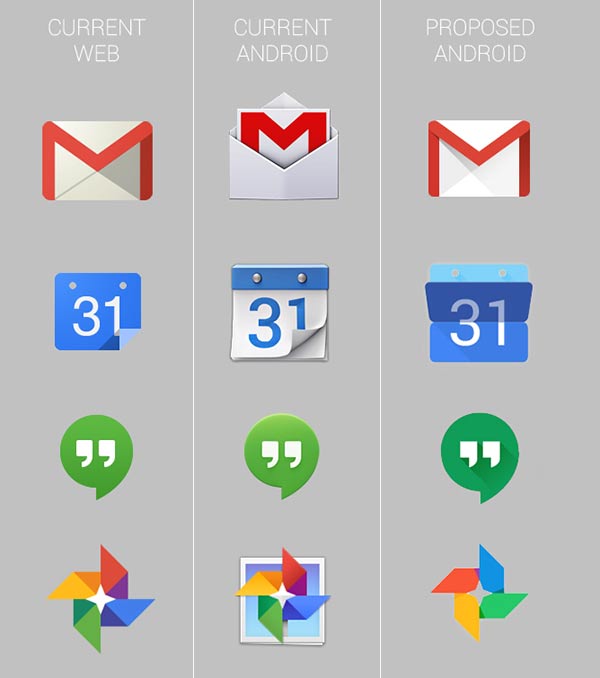
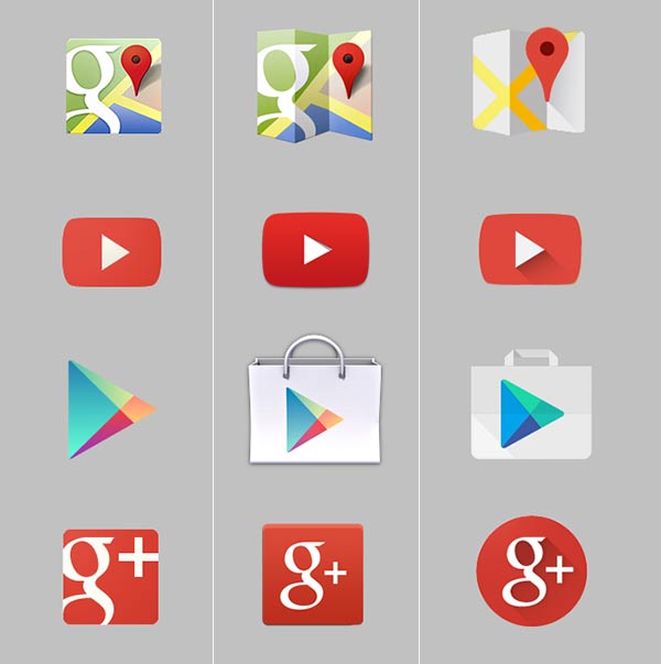
It appears that Google is planning to make the look of its app and service icons more coherent across the web and Android. A set of icons shown in a news piece by Android Police purports to compare a set of web icons, current Android icons and proposed Android icons which will appear in an upcoming Android update, perhaps in Android 4.5 Lollipop.
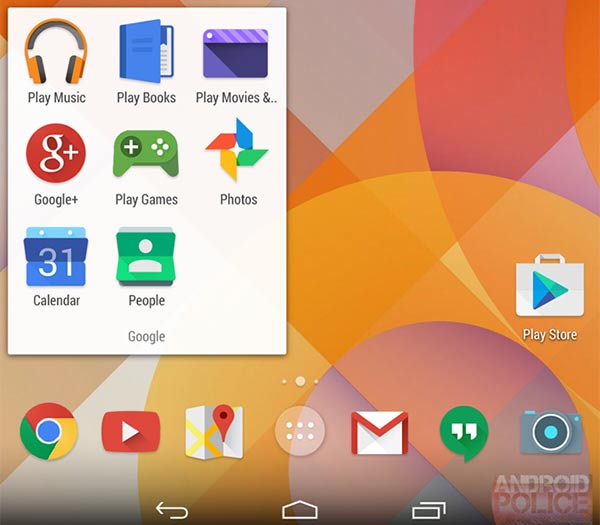
The new 'proposed' Android icons look to borrow much of their new design from the web icons, which are more readily updated by Google. Verifying their authenticity to some extent there are also new calendar, video and maps icons, similar to the proposed examples, to be found on a Google partners connect page.
The new style name given to this icon set is 'Moonshine'. According to Android Police this is the design language for all upcoming Android icons. The designs look somewhat flatter, like the trend in Microsoft and Apple mobile OSes, but there are playful 'paper creases' evident in a few of them, to give dimension. Also Google hasn't dumped every drop shadow but has pulled it to the foreground and made the South Easterly shadow edges generally more contrasty.
While the new Android icon set does looks like it's taken some cues from the web icons it still looks different so perhaps this is an early in progress visual or things are going to remain different between the platforms. It does make sense to retain some key visual difference for when you are on Android and you might see both the Android icon and the web icon on the same screen.
If these icon changes are coming in a new version of Android then designers better be given access to a new design guide shortly. Currently Google Android developers are requested to make icons as follows; "Use a distinct silhouette. Three-dimensional, front view, with a slight perspective as if viewed from above, so that users perceive some depth."


