Speaking at the Ideas Economy: Information 2012 conference in San Francisco, Twitter CEO Dick Costolo offered up some tasty morsels of information about the company’s business. He revealed that Twitter has made more money through its mobile platform than the full-fat website on many occasions during last quarter. Contrary to Facebook’s experience, the growth of mobile use of the social network isn’t threatening ad revenue.
Costolo, in response to a question comparing Facebook and Twitter, replied “We're borne of mobile. We have an ad platform that already is inherently suited to mobile, even though we launched our platform on the Web and only started running ads on mobile recently.” The popular microblogging network started to introduce ads into mobile app timelines in February and has also allowed advertisers to send promotional tweets to iOS and Android users of Twitter (60 per cent of the user base).
Twitter users produce 400 million tweets a day from a core of 140 million monthly active users. Twitter revenue figures are estimated to be in the region of $260 million for 2012 rising to $540 million in 2014 according to eMarketer Digital Intelligence.
In contrast, the Facebook mobile platform with its 425 million monthly active users, revealed that it wasn’t making any profits at all at the time of the IPO filing in February. However this week Facebook mobile advertisement API added “sponsored stories” ads, making it a simpler and easier option for would-be advertisers. So fingers crossed for the shareholders.
Twitter’s new logo
Twitter has a new logo, though it’s not immediately obvious without comparison. There are lots of strict guidelines about the use and placement of the new logo which amount to don’t mess with the bird or put anything near it, also we don’t use the text anymore.

Guidelines; no more Web 2.0 "t"
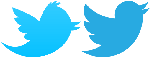
The official Twitter blog post about the new logo gushes “Whether soaring high above the earth to take in a broad view, or flocking with other birds to achieve a common purpose, a bird in flight is the ultimate representation of freedom, hope and limitless possibility.” Also there is a video showing how the new logo form is made up of three sets of overlapping circles, “similar to how your networks, interests and ideas connect and intersect with peers and friends” I think it does look a lot cleaner with the new hair cut and the wings are also in better proportion to the body now.

 Old logo above and left, new on the right


